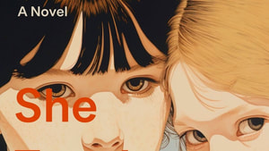
She Taught Me Everything
Wrote it. Now for the next part.

Wrote it. Now for the next part.
|
I swear I was not lurking at the Barnes & Noble. I was there to take a photo of my novel in the wild. It's perhaps endlessly thrilling to see the thing you've worked on out there sitting on a library shelf, a bookshelf, someone's hands...  But truly, I was NOT lurking. A pair of young women drifted past the table of stacked books, and one, Rachel, picked up my book. "Squeee! You just picked up my book!" I said. "Wha?" she said, not yet fully alarmed by my obvious excitement. "Look on the back!" She flipped the book over and compared the author photo with my face. "It's you," she said. "I know!" I said, then, because emotions: "I've got goosebumps!" "I picked it up because of the cover." "It's beautiful," I agreed, without the slightest self-consciousness. "And it's about sisters!" Were they sisters, I asked, indicating Rachel and her book-browsing friend. "No. But we both have sisters." Rachel gave me a shrewd look and added, "Is this inspired by a real sister?" "Yes," I said, truthfully. "But my charismatic older sister is much nicer than that one." "Oooh," Rachel said. "I'm a charismatic older sister." And that, gentle reader, is how I accidentally strong-armed an unsuspecting passer-by into purchasing a copy, as well as how I ended up signing a short stack of books at the Barnes & Noble bookstore this afternoon. Thank you https://www.facebook.com/bntampafl Barnes & Noble South Tampa. And thank you, Rachel!  In other authorial news, I was invited to map the settings for She Taught Me Everything into a nifty little app called Squirl. Squirl is designed to help users, as its tagline announces "Discover the places described in books."  You can visualize where a book is set. So, is Brooklyn Heights your hometown? What snippet from the book did this author choose to go with the pin on the map for Brooklyn Heights?
You can check the map for books set in any given place—a special treat for bookish folk: to see the locations we've read about. Or, if you're built this way, it's a way to pre-view spots before visiting by finding books to read that are set in a specific spot. I love this idea, and hope other authors and their publicity departments will pile on! Thanks https://squirl.co/
4 Comments
Jill suggested they read She Taught Me Everything for the group, and even though Jill had moved away, they read the book. I Zoomed with the group in May and had a really wonderful conversation about the North Country, these characters, and books in general.
Fast forward a few weeks and while browsing at the St. Lawrence University bookstore, Ana ran into Betsy Kepes of North Country Public Radio and recommended the book. Betsy then reviewed my book for her radio broadcast! And liked it! Yay! Click on the picture and it will link you through to the podcast/broadcast... "Mathy Math, Math-Math." That's how one of my friends hears any discussion of numbers: "Mathy-mathetty-math-math." But even the most innumerate of us have landmark numbers. These are the numbers that maybe we learned to count by (5-10-15-20, for instance) or numbers that just feel less challenging to keep in mind (100 vs 97, or a dozen vs 13). I'm approaching a landmark number as an author—a fact that is truly of interest to nobody but me. Has that yet stopped me from writing about anything? No.  The babbling brook at Davy Crockett's birthplace. During my feverish rush last year to get current in my understanding of modern publishing, I gathered some depressing facts. About half of the US population does't read even a single book a year. Not a surprise, but oh! poor creatures! Also, most books will sell less than 300 copies in the US (1000 copies factoring in all formats across the world). Not just in the first year, btw, but ever. So if, let's say, you just so happened to be pouring your life-force into the creation of a book, this base truth is helpful for framing one's expectations. Joyfully for me, I have at least 300 friends kind enough to buy my book. I am grateful for each one. It's a deep thrill every time someone tells me they have read it. Which brings us to the wonderful-to-me landmark number: 1000. On Goodreads.com, a website helps 150 million readers track and rate books, She Taught Me Everything is inching closer and closer to the 1000 mark. Meaning that nearly 1000 readers on that site—mostly strangers! people who love to read and who judge by covers!—have either already read or plan to read the book.  They might be getting it from the library (ooh! If you use the library, consider requesting STME), or from a bookstore, iTunes or Kobo, Barnes & Noble or Amazon... But 1000. Whatever expectations I had six months ago, this number feels a lot bigger than 999. 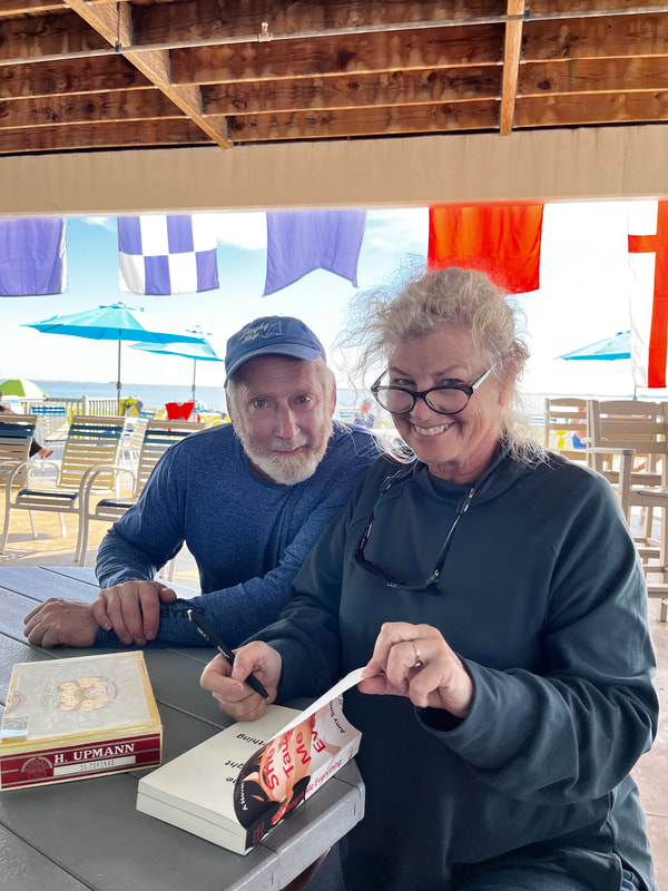 Signing at the Sunfish Masters Regatta. Thanks Jim Koehler of the Dinghy Shop! A few sources on the numbers... bulletin.kenyon.edu/article/burning-question-math-illiteracy/ https://ideas.bkconnection.com/10-awful-truths-about-publishing#:~:text=Average%20book%20sales%20are%20shockingly%20small%E2%80%94and%20falling%20fast.&text=Even%20if%20e%2Dbook%20sales,all%20formats%20and%20all%20markets. https://www.publishersweekly.com/pw/by-topic/columns-and-blogs/soapbox/article/6153-a-bookselling-tail.html https://countercraft.substack.com/p/no-most-books-dont-sell-only-a-dozen https://jerichowriters.com/average-book-sales-figures/ As soon as someone admits to me that they want to write, I point out that there one single action that writers do, and which nobody else does: they write. You want to write? Write! Like everybody offering unsolicited advice, I'm pretty awesome at suggesting solutions. As for following my own recommendation? Erm. 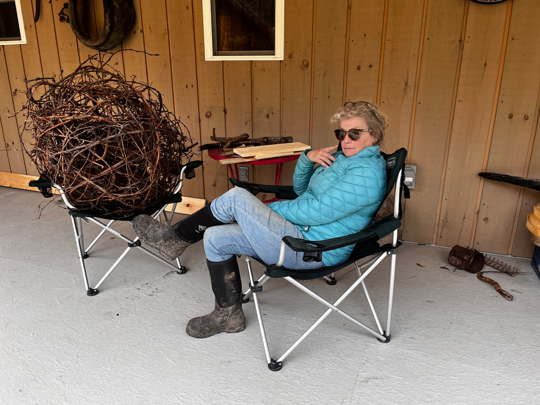 Why yes, I constructed that rather large ball from grapevines. I offer no reasons. If my house is clean, and there's a complicated meal in the oven, and I have reorganized the books or weeded all the gardens, let's just say as a writer, there's room for improvement. Since I'm working mostly for myself (and you, dear readers) these days, I go easy on my work shortcomings. Distractions are merely side-quests. 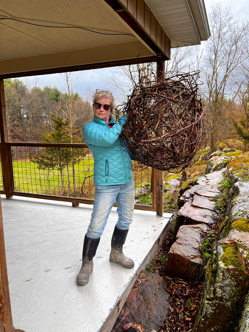 Yeah, no, I don't know what I'm going to do with the rather large, albeit decorative globe. In the novel that I'm trying to finish right now, (or is it a novella? It's a lot shorter than She Taught Me Everything but okay) one of the characters spins wool and linen. The story's set in a pre-Industrial world where there's magic, but she's often to be found spinning away. Do I know how to spin wool or linen? Do I need to know? Pffft! I make up shi—ooh! There's a CLASS! Just so happens I bought a plastic sack including some wool and a spindle last year at the thrift store. One human's trash is another person's back-up hobby supplies. Add in a pleasant day spent in the company of an enthusiastic teacher (thanks Julia at the Thousand Islands Arts Center!) I now, as have our ancestors for thousands of years, can use a drop-spindle to make wool yarn. 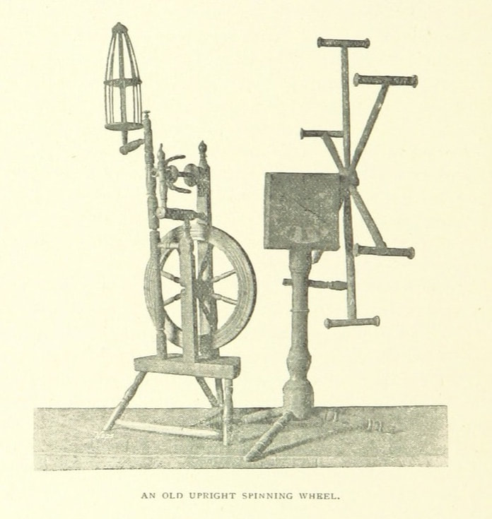 Spinning wheels are SO 17th Century...Copyright-free image from the British Museum. The process of making fiber behave is not unsimilar to making twine from nettles or willow. Missed that craze? here's my link: http://www.amysmithlinton.com/blog/paleo-crafts Spinning can be pretty lo-tech: a hank of wool, a stick, and within moments, you create a fluffy bit of innovation. Kind of like magic, really. Or like writing... Nearly everything gets a rating these days.  Oh how I ache to work in a reference to the soccer fans' chant about Roy Kent! Consumer ratings are here, are there, are every-something-where for some really good reasons. It's hard to trust the internet. I know, reeeeeealy? Most of us wonder is it advertising, is it paid placement, or is it plain old fakery? One way around the uncertainty is to get word-of-mouth recommendations, yet in this marvelous part of the 21st C, that takes time. So we turn to the social part of media: we check who recommends any given item—and we look at customer feedback before plunking down our cash or time. How often has the phrase "worked great for about a week" convinced us to select some other Amazon gadget? Speaking of the 'Zon, shall we walk through how to do customer feedback on the world's largest retailer for a book? Start by finding the book listing on Amazon. Scroll down the page to "write a customer review." Pick a number of stars. Skip over the headline part for now. 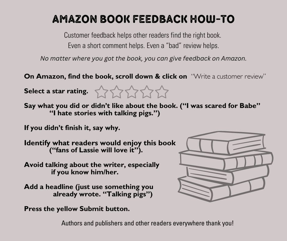 The feedback can feel hard. Stuck for words? Think about the Who, What, How, Why, of the story: Who did you like or dislike in the characters? (For Moby-Dick, "I liked Ahab, he was poetic and strange.") What kind of story was it–sad, humorous, romantic, spicy––and did you enjoy that? ("The story was one long whale chase on the high seas. There was a lot of belly-aching, which I could do without, tbh.") How did the book unfold, how was it told, how did it make you feel? ("Moby-Dick has beautiful descriptions of a lost way of life, which I really appreciated. The obsessive captain was so emotional I was kind of tired just reading it.") and Why or not you recommend. ("This book is a classic, and it's hard to read, but in the end I felt like I really accomplished something.") If you didn't finish the book, say why. ("My own white whale showed up.") The only do-not? Don't mention or imply a connection to the author. Amazon doesn't want someone's mom stuffing the ballot box... Finally, send a flare up for readers who might like the product. ("This is good for fans of seafaring adventures or anyone working on their vocab.") Then go back to pick a headline ("Vocab on the high seas") Press the "submit" button and voilá! you have provided insight for readers, writers, and publishers. You rule.  Pro tip: you don't need to buy the book from Amazon to share your opinion about it. Yep. You can go in and share your opinion regardless.
Same with other retailers like KOBO and Barnes & Noble... those links can be seen here, btw. www.amysmithlinton.com/get-a-book.html Even if you didn't enjoy it at all, don't be shy. It's helpful for other readers to know that someone else has given the book a try and has had an honest reaction. Cheers! 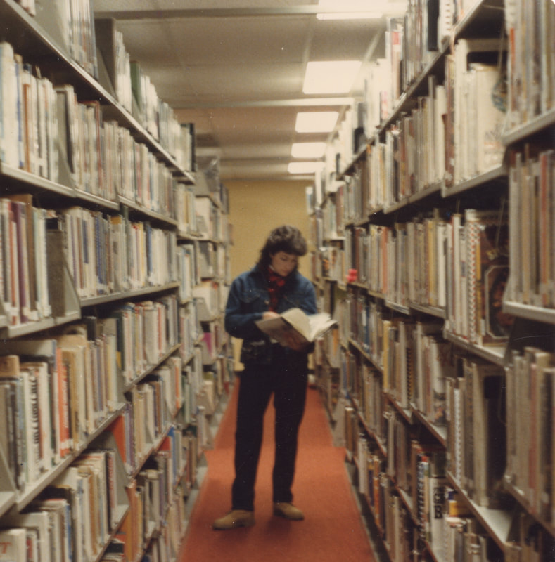 I spent most of the school year when I was 10 hiding out at the school library. Not really hiding out: my fifth grade teacher, Mrs. Jarosz and I had what my mom described as a "personality difference." It's happened several times since: I meet someone and, AbracaBADra: I'm unable to say anything without offense; my attempts to reverse course only make it worse, and--ugh. It's weird. It seems chemical. It's inexplicable and powerful. But the fifth grade, a person has fewer options. 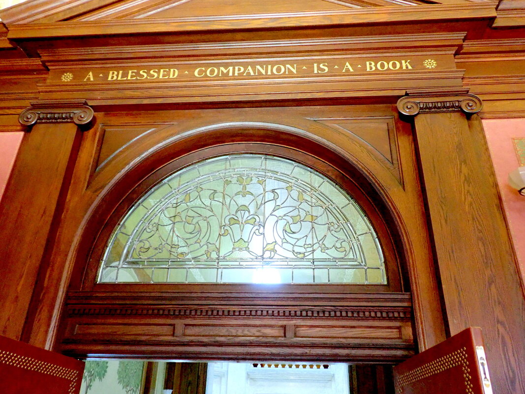 Luckily, we had a library in the cool old elementary school. And inside the doors of the library—a couple of wonderfully kind librarians who helped me learn the card catalog and the shelves, and best yet, taught me how to follow my curiosity from book to book to book. After being "Present" for roll-call, I'd agree with Mrs. Jarosz that I might go to the library. Until lunch. After lunch, I'd get the nod again. I'm sure I missed learning something in class, but I couldn't tell you what it was. My seven-times table, maybe, I'm still foggy on 7x8 versus 6x8. 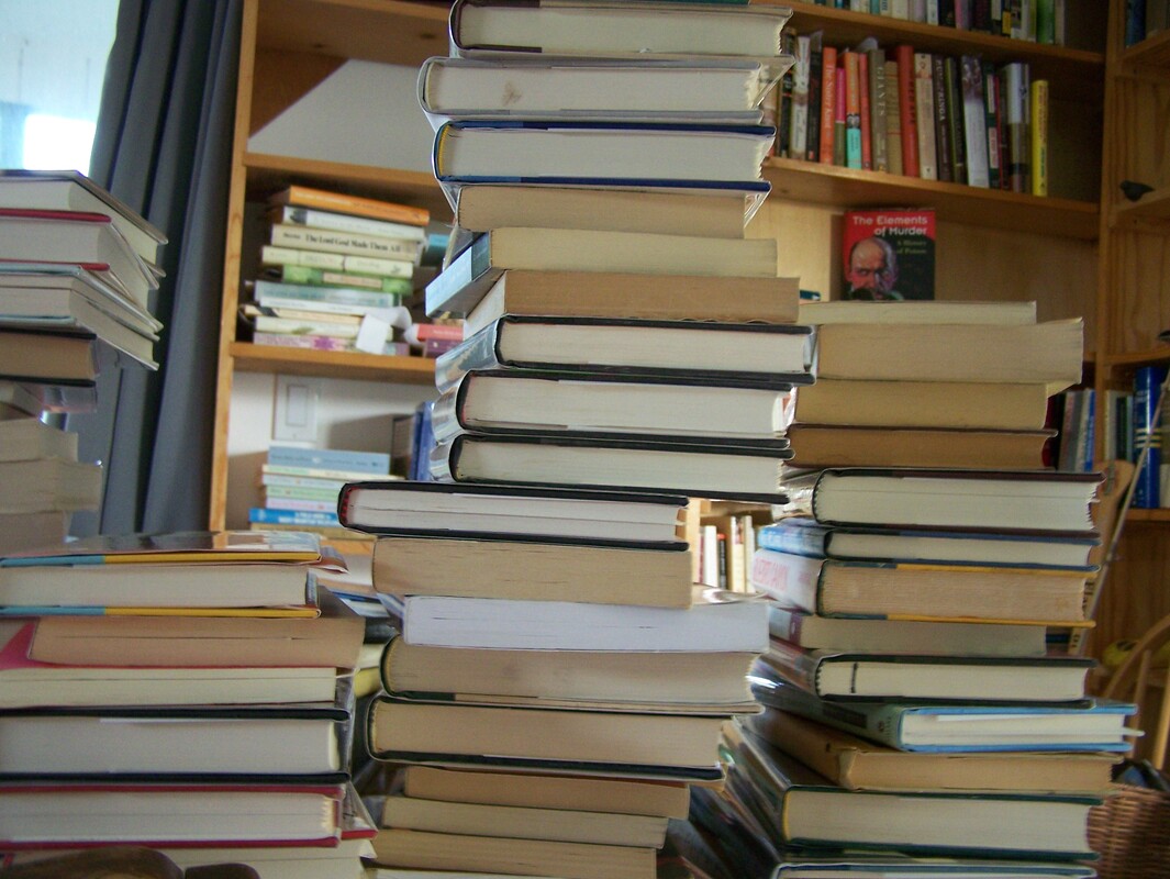 So my love for libraries runs deep. And part of my lifetime writing dream has been to see my own book on those shelves. I do understand, with the perspective of decades of library visits under my belt, that the shelves of a library are not immortal. Titles churn through and are lost to library fundraising sales. But then again: a book in the library...that's something. I dutifully submitted a copy of She Taught Me Everything to the local county public library system, but while awaiting the thumb up or down, I noticed this... 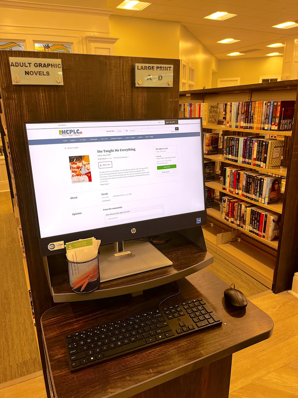 Looks like the system has already purchased an e-book copy, and THERE ARE SIX PEOPLE IN LINE to get it! Well, how about that? I wish I could share this joy with the librarians who helped me through 5th grade.  Meanwhile, should you be so inclined, ask your library to order a copy -- not only with it bring joy, it might bring you a useful gift card.
The first photo of She Taught Me Everything on your public library shelf gets a prize!  One of the funny things about publishing is that nearly everyone involved—from writers themselves, to editors, sales people, service providers, web designers, readers—has an interest in words. (I promise you, this statement is not reductive.) For example, I use an internet service that helps me keep track of where and when I send stories into the world. The service, duotrope.com, also tells me about sketchy markets to avoid, contests that might appeal to me, and publications that might match my story. It's a nifty tool, especially if you are submitting a lot of stories to a lot of publications. But to my wordy point: let me share this little gem from Duotrope: 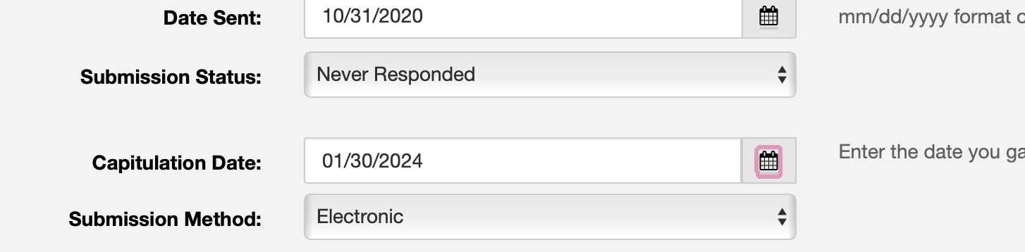 This is a partial screen grab from a story submitted somewhere in 2020, and which I just recently updated as "Never Responded." This is a LOT less uncommon than you'd think. A roaming black hole in the publishing universe swallows many a hope, dream, and story.
But note, if you will, how the designer of the page labels that date when I say the publication "Never Responded." It's not the date Accepted or Rejected. It's the Capitulation date. I have capitulated, which means "to cease resisting" or "to give in." Someone behind the scenes at Duotrope is absolutely slaying it. Modern book clubs are a wonderful worldwide phenomenon: a social occasion to maybe enjoy a bit of food and beverage for the purpose —ostensibly—of discussing a book. Clubs vary widely: some are focused on the wine and the company. Others look into the origin of the book or what affect the book has had on our world. Still others are all about the feels.  So when I was invited to attend my first book club as an author, I wasn't sure how it would be: would I get a grilling for my choices of plot or writing style? What if they hated it? What would readers want to know? And what did I want to tell them? As it turns out, so far, I am most moved to say "Thank you!" It continues to surprise me how wonderful it feels to have someone else read the words I typed out. To have people commit to the time (let alone money) is an honor. Here's my giddy reaction video after the first club meeting, which I did via phone: I've got another four club appearances lined up (half in person, half by phone), in the next couple of weeks and I can't express how lucky I feel.
Got a book club? If She Taught Me Everything might be a good fit for your group, I'll come by and chat! I've even got discussion questions... To celebrate the first month of publication of She Taught Me Everything, I made up a "Face in the Place Photo Contest." My dear readers sent in photos of themselves reading the book. 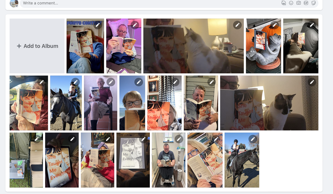 early days... There were a gratifying lot of photos -- some people included pets, others snapped the picture unlikely settings, many included libations and snacks. It was heartwarming. I put those images into a montage -- with music! oooh! It was so much fun I did it twice. Truth be told, I'd like to have done the one and be done, but the cool music track didn't track across social media gaps, so we have us a TikTok edition and an Instagram one too. My favorite skipper picked a name from a hat (my actual hat) to chose the lucky random winner of the Face in the Place contest. And the lucky winner was...Kathy Lacey. We did a handoff of the loot (a gas card) in a grocery store parking lot. Not sketchy at all! 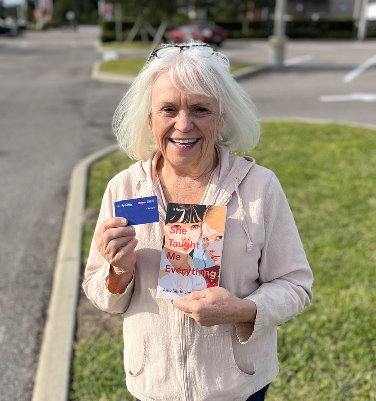 And because of his bold choice of photo shoot, Mr. Mark Taylor earned himself a viewer's choice award. A gas card! 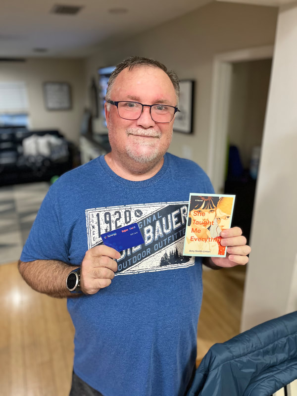 It was great fun for me, and I hope my shutterbug readers enjoyed it as well.
I'd like to do another contest. I'm a fan of fabulous prizes from way back –– any suggestions for ways to award such things? According to the inter webs, one predictor of a book's success is the NUMBER of reviews it gets. High ratings are great, of course, but the odd 1- or 2-star review can actually be helpful in showing potential readers whether the book will be a good fit.  My readers have been remarkably generous, awarding stars and giving thumbs up (it's a whole other blog post on how a single "This was helpful" click works. Whoa!), and jotting down kind things about the book.  I am psyched to see reviews coming in, but honestly, I almost don't look at them myself. First, I have a generous dollop of self-confidence already––without any real external encouragement. (And I'm reluctant to burst that bubble on purpose.)  Second, as I was reminded recently, reviews are for READERS. So let me toss it out there: You don't need to write a review for me, but DO, please, jot a note on Goodreads, or Amazon, B&N, iTunes, Nook, or the bathroom wall. Say what you liked or didn't, say whether it's your usual cup of tea, but say. Your reaction and your opinion are in truth that rare gift that keeps on giving... Transom light over a door at the Roswell P. Flower Memorial Library. My first favorite library. |

