|
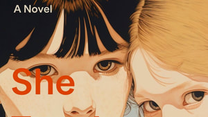
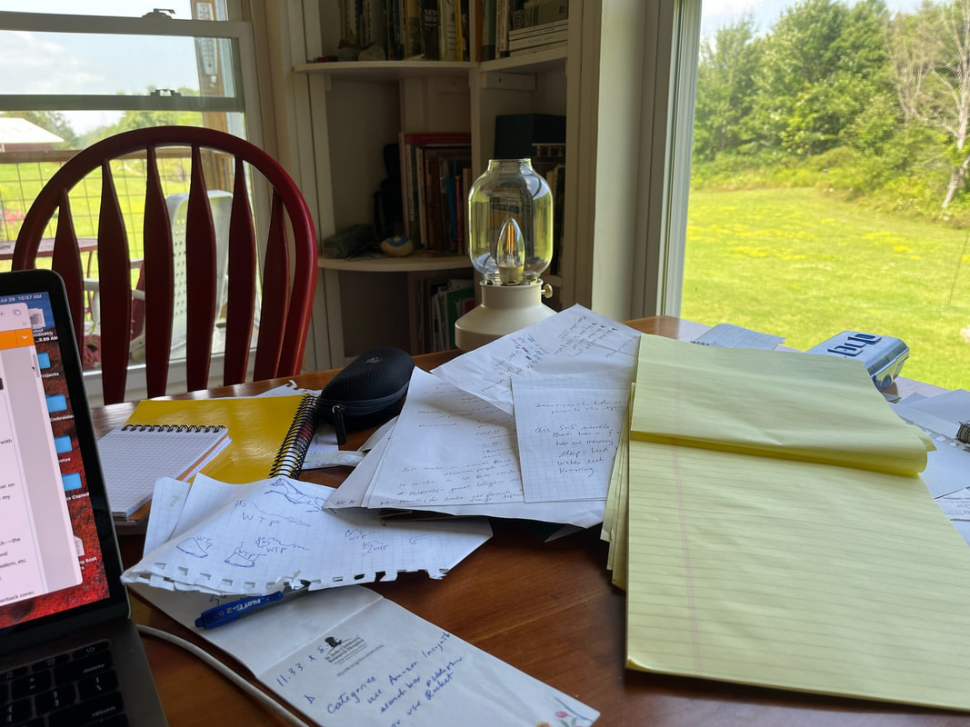
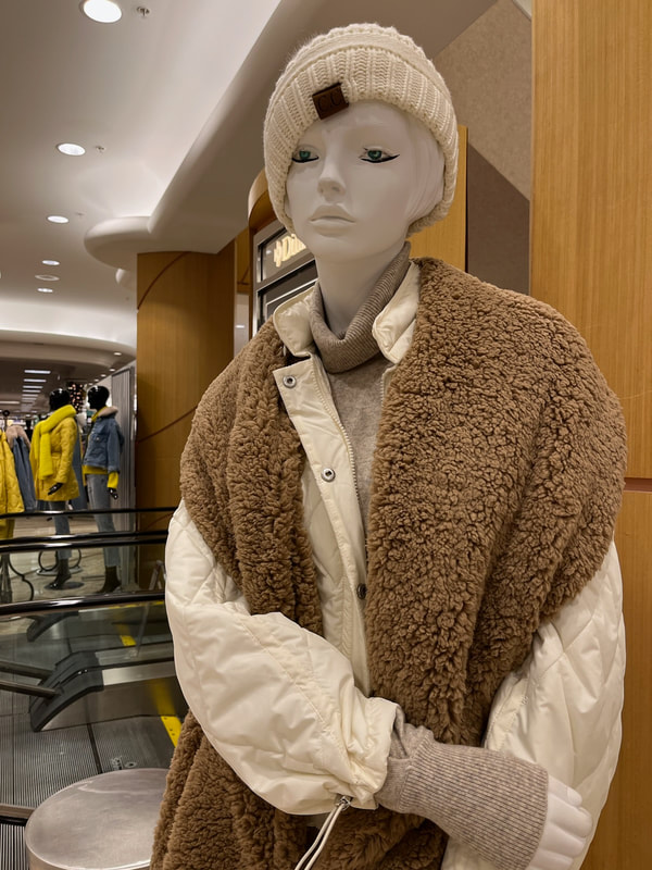
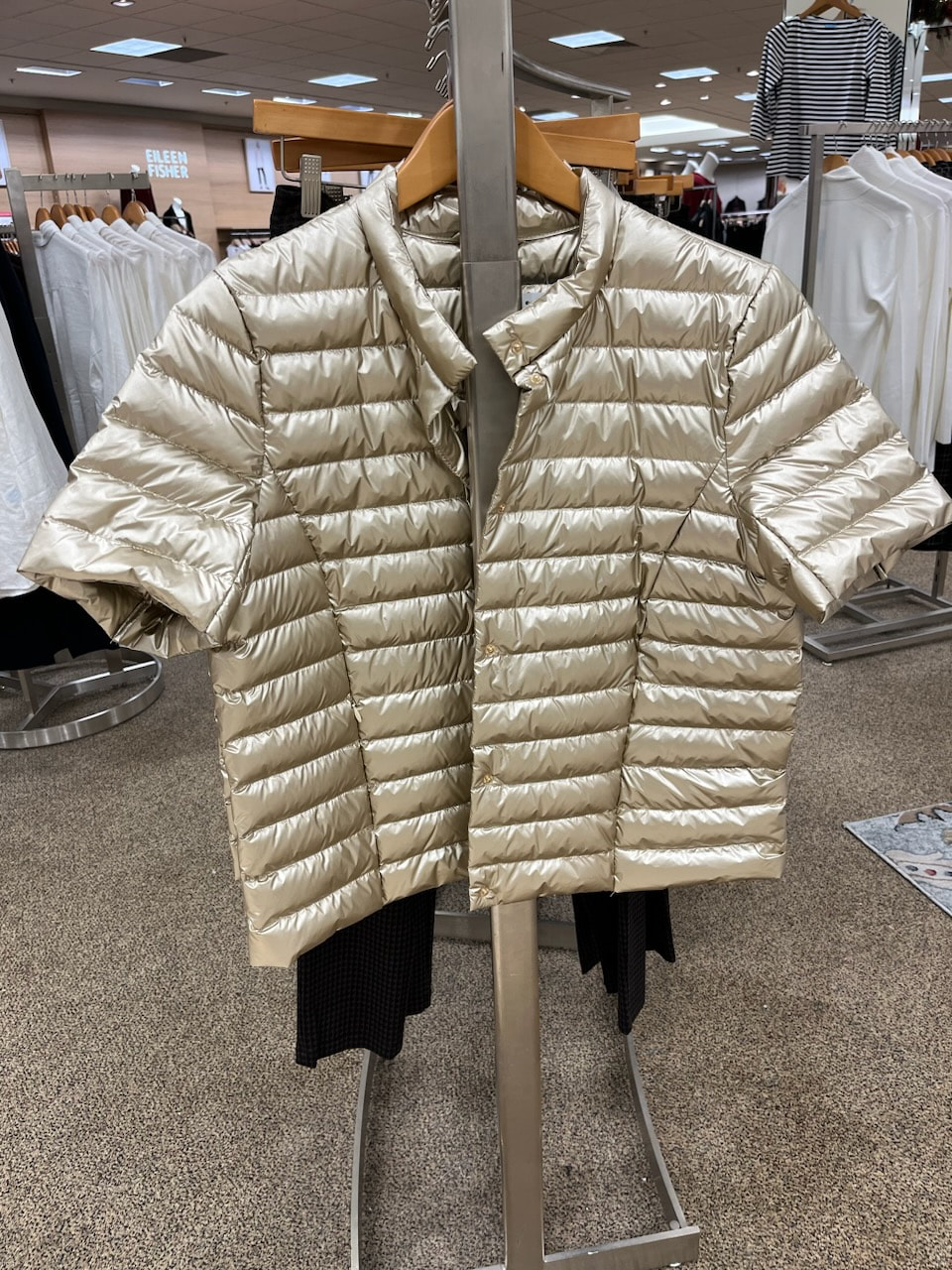
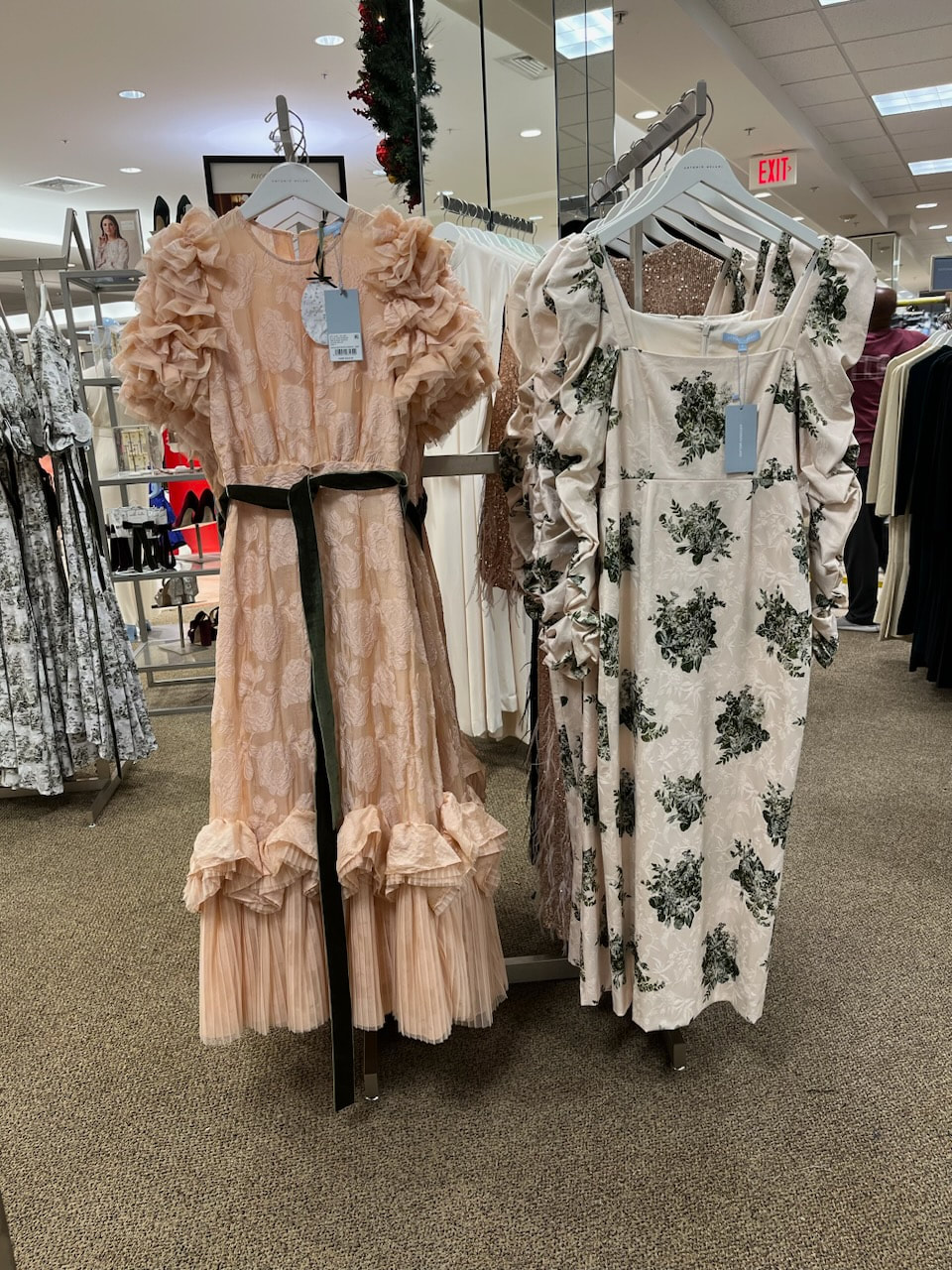
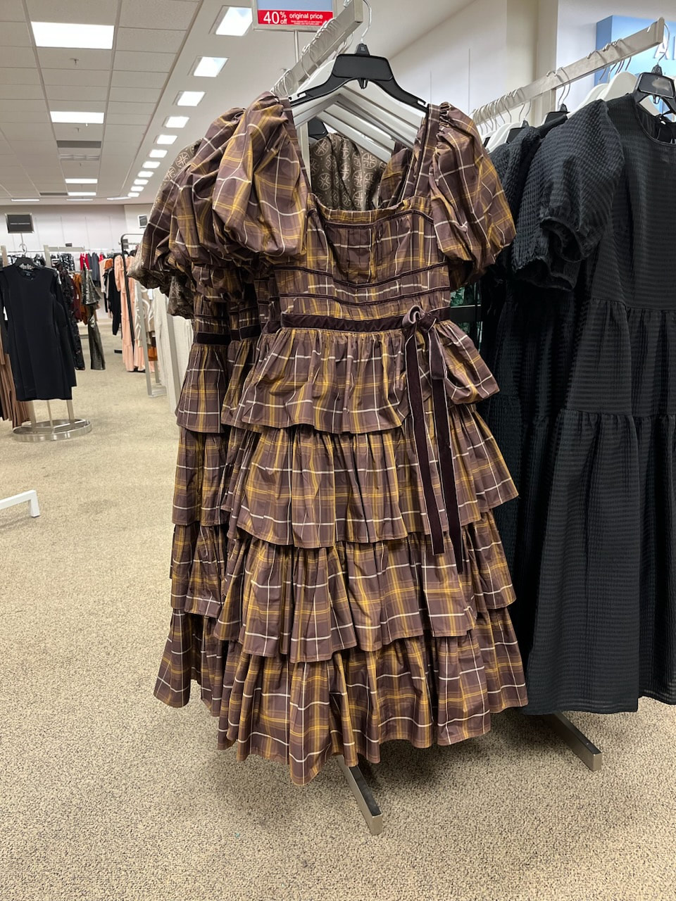
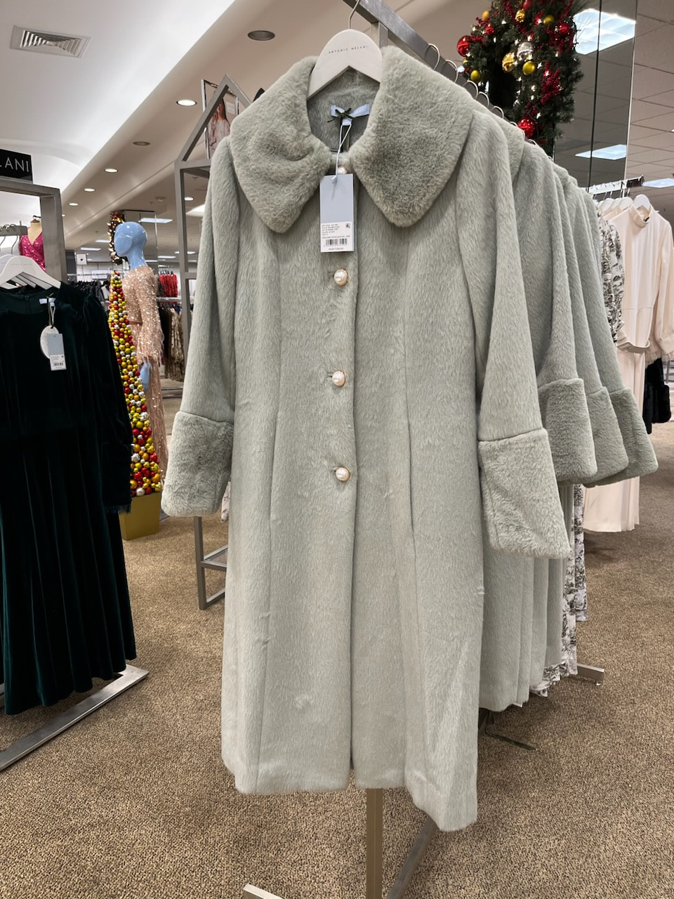
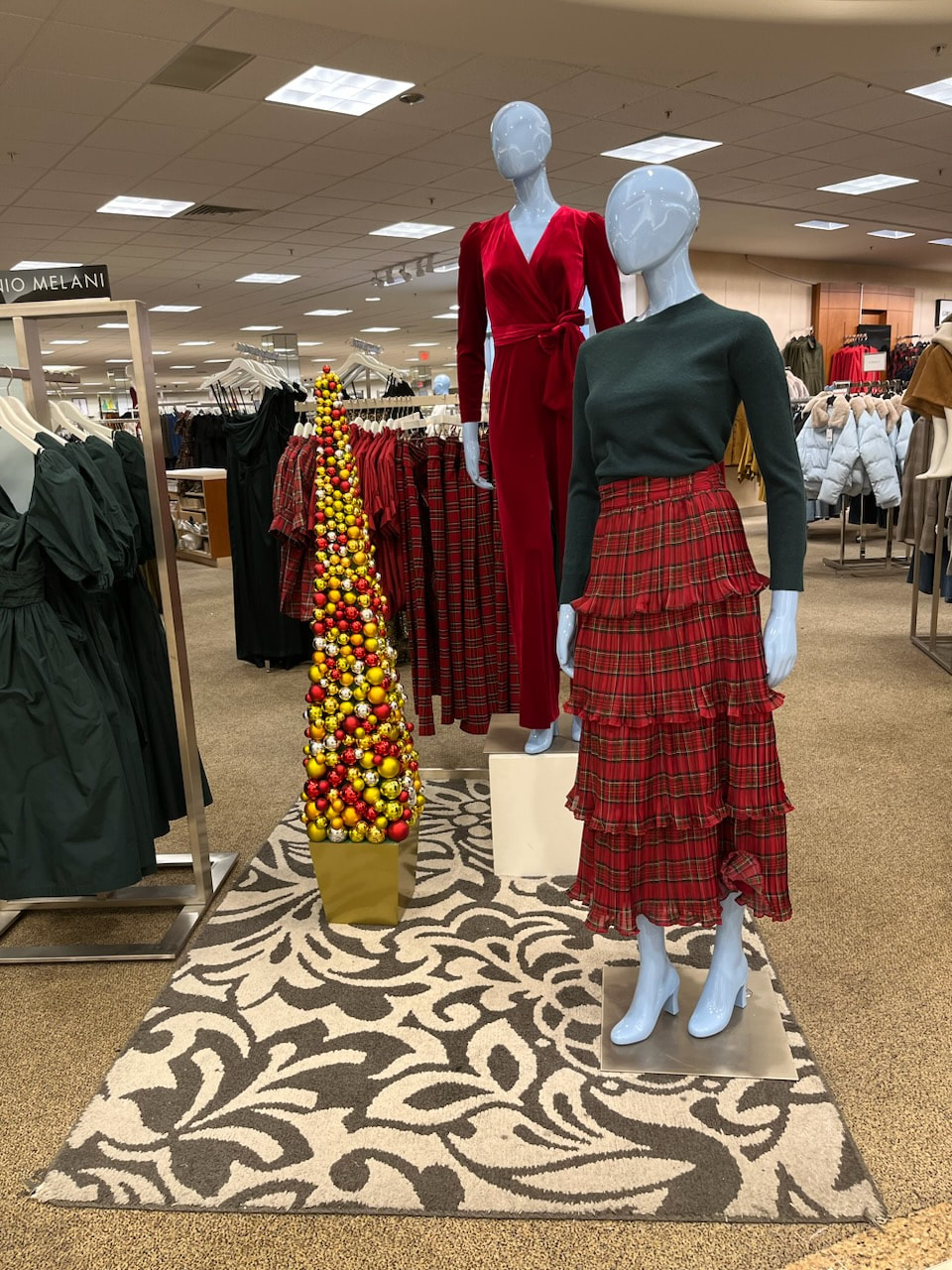
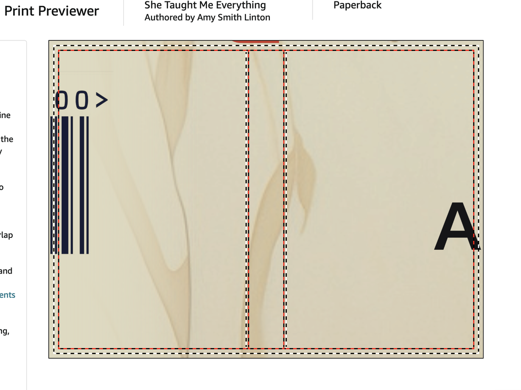
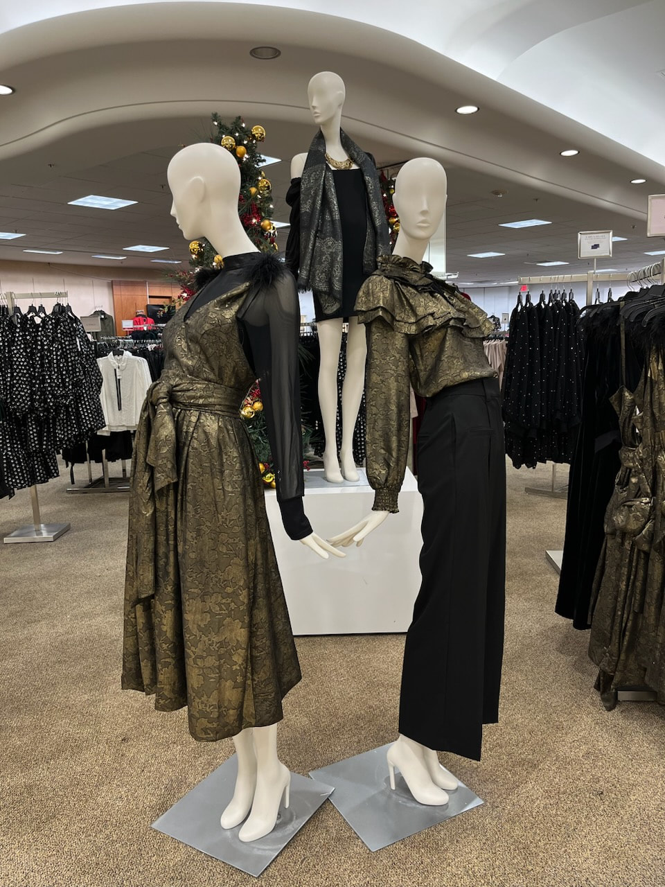
On a random Tuesday in July, I started a contest on 99designs by Vista to create a cover for She Taught Me Everything. 99designs matches designers from around the world with work. They have excellent reviews and an easy-to-use website. On the website, I filled in details of what should appear on the front, back, and spine of the book, and then gave my direction: A beautiful cover for a literary novel about sisters. I picked a palette (pumpkin, teal, and black––the colors in various intensities from pale to vivid) and attempted to hone in a style: minimal, clean, modern, etc. using the built-in slider-scales for each quality. I noted that it would be both e-book and paperback cover, and that it should remain distinctive even when shrunk to thumbnail size. I included half a dozen images of book covers I liked. Finally, I listed things I did NOT want. For instance, no covers that use stock photos literally. Please no white backgrounds (it fades into online listings). Also, none of that "faces merging" trope that's been popular of the past couple of years. I think I had no more than clicked over to Facebook and removed a few spammy posts from the Flying Scot page (what is UP with that crap?!) before returning to 99designs. And there were 3 entries! Next morning, 23. By end of day, 51. At the end of the four-day-long contest 120+ images for my perusal and selection! From perhaps 55 different designers. In the same way that I have remind myself that the point of clothes shopping is NOT to identify the most hideous outfit*, I tried to breeze past the images that were frankly unsuitable: the straight-from-Canva ones, the really amateur ones, the merging-faces covers, the ones where a menacing hooded figure peers out from under serial-killer red letters. Gah. That comprised maybe 70 entries. Because I've lived with a lot of mysterious rejection in my working life, I made a point of responding to each entry, offering at least a general––and I hope kindly––reason why. There's a nifty messenger system built into the 99designs site. Of the remaining 50 entries, some were immediate stand-outs, and others were potentially good. I fired off messages to these folks too, expressing my enthusiasm and, again, offering my opinion. Things started to get more interesting: having worked on book covers at Farrar, Straus & Giroux, I know there's going to be a bit of back-and-forthing. I deselected several designers based on their reaction to my note. The one who spent several paragraphs telling me my opinion was wrong (I found his design "delightfully retro") sorry! We can agree to disagree no farther, sirrah. One classy all-type cover had potential, and I asked if the designer might consider changing up the colors so that it was not on a white background. Instead, she sent me an all-red cover that she was certain captured the essence of the book. It did not. But thank you! I don't doubt for a minute that I'll be seeing several of the covers IRL. There were images that would be excellently suited to young-adult fantasy novels, suspense novels, stories about middle-grade children on a walk in the woods. After narrowing the list, I enlisted help from a few design- and book-minded friends. I treasure their help and salute Ned Johnston for winning the internet with a pithy comment about a beautiful but underwater cover, "She Taught Me Everything...about scuba diving without a tank." I spent a chunk of time researching the potential finalists' background and winnowing out those who did not have previous experience with book covers. It's enough to feel my own way along this rocky trail by braille. Achieving a new plateau of agita to pick finalists. (Did you know, as I do now after looking up its spelling, that "agita" means both anxiety and indigestion? How wonderful is that?) If I were able to go back in time and offer advice, I'd say, "Yo, pick finalists on a Monday, not a Friday!" and "Include a safe pick that's maybe not wonderful, but that would be good enough." I did neither of those things, and the weekend felt remarkably high-stakes-y. I made my decision after following Daddo's advice to ask myself before sleep and made the hard call––I mean message–– the next day. So was I then ready to announce the winner? Nope. There's a period of time for the files to be finalized (yipes! is that the right ISBN number?!) and sized to fit the applications, contracts signed, before that final handover. So now can I? Nope I did a test run with the files to be sure to get what I needed: art for the an ebook cover (essentially a front cover) and the print cover (that single piece of heavyweight paper that wraps from back to front) on the paperback. Do I need to send this off to the printer in New Jersey? No, I simply upload files to Amazon and check out their "previewer." Oh brave new world. But you do have to figure out a variety of other marketing things: categories and key words, for instance. And you do have to enter whatever remaining personal data that Amazon doesn't already know. Now can I reveal the cover? Nope. Because the preview ended up looking like this. And while I can make the inside pages of the novel are look pretty nifty, I am not especially equipped to resize graphic files. I mean, I could try importing the image into Word and resizing it that way, but surely that's a crime against art. So, this story goes on continuing. *These fashion photos came from an ill-fated browse of a high-end department store last December. These are supposed to be festive holiday outfits. I can't even. Has the industry forgotten how to be cheerful?
2 Comments
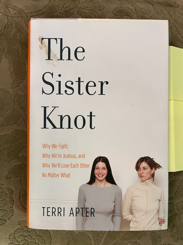
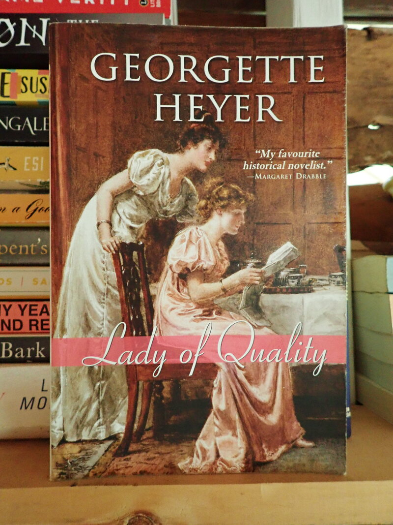
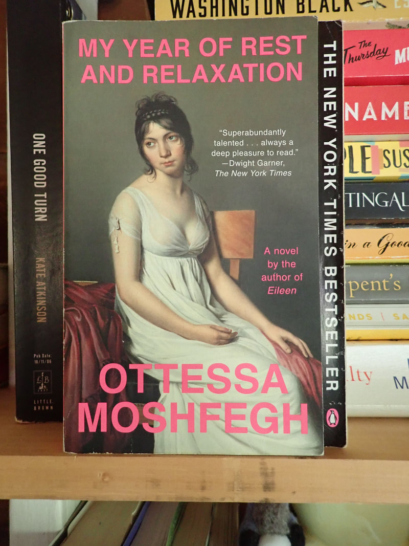
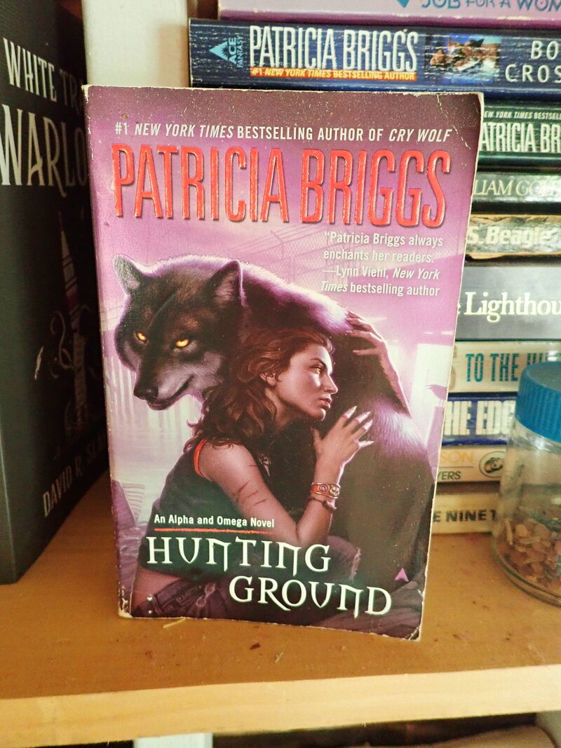
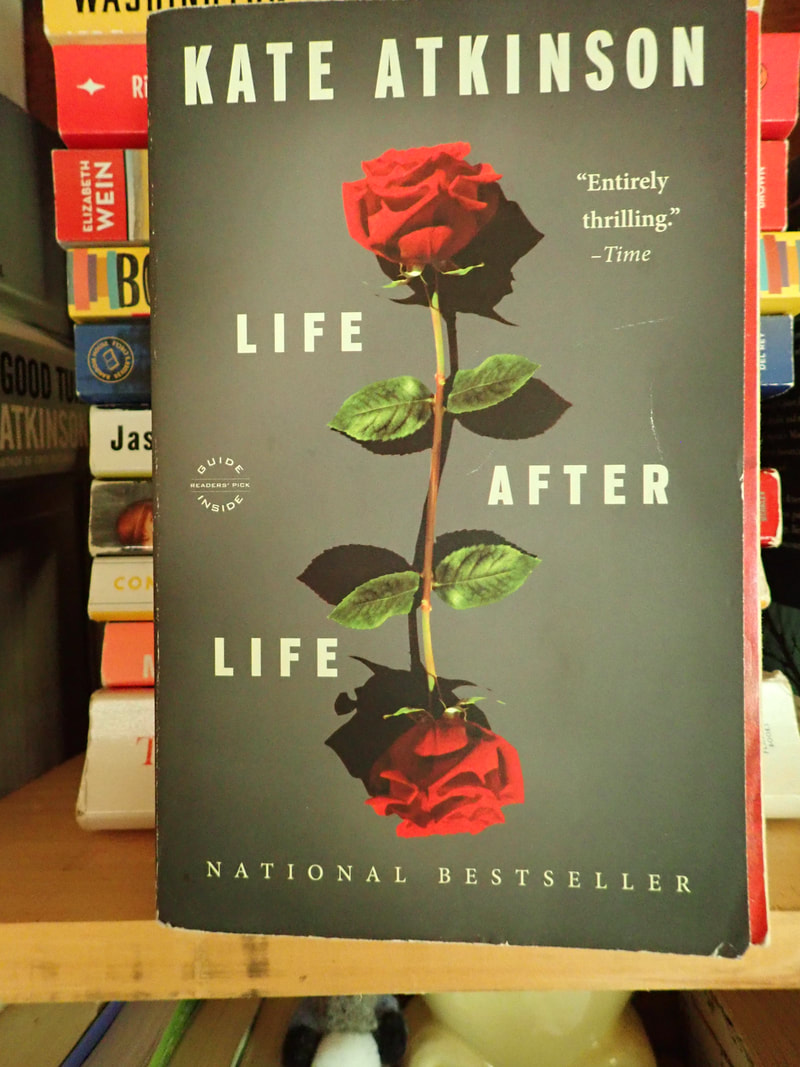
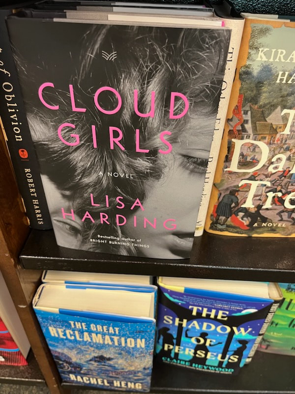
We judge books by their covers. Most of us can take in––at a glance––what sort of book a book is. And that's not a bad thing. For instance, two covers with similar images: white ladies in Regency outfits, probably sourced from period oil paintings. The Georgette Heyer looks like a romantic romp of some sort, while the Moshfegh promises NOT to be any sort of sprightly entertainment. The difference is in the design: the mood of the paintings, the placement of the words, and the font. Signifiers. Got metal-foil raised letters and a stylized weapon on the cover? Military suspense. A cool photo of someone from a decade or more ago? Maybe a memoir. Hot pink cover with a pair of oversized sunglasses? Probably an amorous adventure set in the big city. Signifiers can include the obvious (woman+wolf with manly torso) as well as the more subtle (the type font for Hunting Ground is specific to fantasy/speculative fiction. It's all about helping the reader find the book. A cat lover would know that Hunting Ground might not be a good fit. With covers like Kate Atkinson's Life After Life, signifiers are subtle on top of subtle: the font choice says "serious" but the image is...peculiar. The roses are pretty but imperfect reflections, which kind of tugs at the attention to make sense of it. As befits with the theme of the book. The point for an independent publisher like myself? It means it's time to get a cover on this novel. In strictest honesty, this process started earlier in the year, when I spent way too long snapping photos in every bookstore. And browsing listicles like this, or this. And then came the familiar, depressing part, where I started e-mailing designers. And Fiverr. And contacting the designers recommended by other independents. And waiting.
While wall-flowering, I even tried my hand at putting a cover together myself. My skillset lies elsewhere, but I enjoyed Canva. Meanwhile, the stuff inside the cover was chug-chug-chugging along. There's a sort of juggling act I never appreciated when working for a traditional publisher: the book's page count obviously affects the measurements for the book. The design of the interior can change the page count by a hundred pages in a big novel like mine. BUT the interior should coordinate with the cover. You kinda have to get everything done at once. I've got word processing skills, so that's cool (my eyes might be bleeding a little, but I'll walk it off). But the cover! Enter 99designs. 99designs by Vista is a design house that attracts a global pool of artists and designers. As a client, you can browse their site and find a book designer. The process takes a lot of looking and a lot of backing and forthing. Or you can host a contest and hope the right designer comes to you. I was reluctant to play this game at first. A little too much like singing for one's supper. But then, I've done my share of sample edits/writing samples to get a gig. Is it so different? So last week, I filled in the design brief, selected a price point, took a deep breath, and pressed, "Start contest." [story will continue...] |
Archives
July 2024
Categories
All
|
