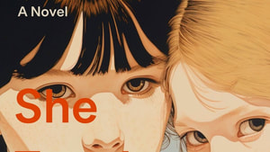
She Taught Me Everything
Wrote it. Now for the next part.

Wrote it. Now for the next part.
|
"Mathy Math, Math-Math." That's how one of my friends hears any discussion of numbers: "Mathy-mathetty-math-math." But even the most innumerate of us have landmark numbers. These are the numbers that maybe we learned to count by (5-10-15-20, for instance) or numbers that just feel less challenging to keep in mind (100 vs 97, or a dozen vs 13). I'm approaching a landmark number as an author—a fact that is truly of interest to nobody but me. Has that yet stopped me from writing about anything? No.  The babbling brook at Davy Crockett's birthplace. During my feverish rush last year to get current in my understanding of modern publishing, I gathered some depressing facts. About half of the US population does't read even a single book a year. Not a surprise, but oh! poor creatures! Also, most books will sell less than 300 copies in the US (1000 copies factoring in all formats across the world). Not just in the first year, btw, but ever. So if, let's say, you just so happened to be pouring your life-force into the creation of a book, this base truth is helpful for framing one's expectations. Joyfully for me, I have at least 300 friends kind enough to buy my book. I am grateful for each one. It's a deep thrill every time someone tells me they have read it. Which brings us to the wonderful-to-me landmark number: 1000. On Goodreads.com, a website helps 150 million readers track and rate books, She Taught Me Everything is inching closer and closer to the 1000 mark. Meaning that nearly 1000 readers on that site—mostly strangers! people who love to read and who judge by covers!—have either already read or plan to read the book.  They might be getting it from the library (ooh! If you use the library, consider requesting STME), or from a bookstore, iTunes or Kobo, Barnes & Noble or Amazon... But 1000. Whatever expectations I had six months ago, this number feels a lot bigger than 999. 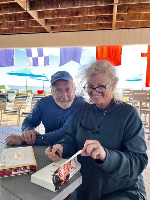 Signing at the Sunfish Masters Regatta. Thanks Jim Koehler of the Dinghy Shop! A few sources on the numbers... bulletin.kenyon.edu/article/burning-question-math-illiteracy/ https://ideas.bkconnection.com/10-awful-truths-about-publishing#:~:text=Average%20book%20sales%20are%20shockingly%20small%E2%80%94and%20falling%20fast.&text=Even%20if%20e%2Dbook%20sales,all%20formats%20and%20all%20markets. https://www.publishersweekly.com/pw/by-topic/columns-and-blogs/soapbox/article/6153-a-bookselling-tail.html https://countercraft.substack.com/p/no-most-books-dont-sell-only-a-dozen https://jerichowriters.com/average-book-sales-figures/
6 Comments
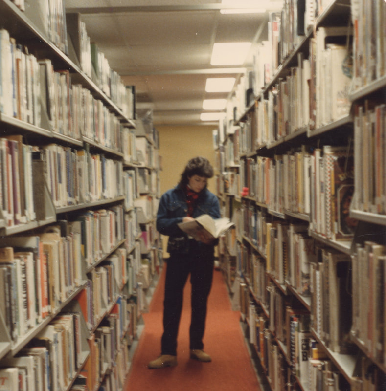 I spent most of the school year when I was 10 hiding out at the school library. Not really hiding out: my fifth grade teacher, Mrs. Jarosz and I had what my mom described as a "personality difference." It's happened several times since: I meet someone and, AbracaBADra: I'm unable to say anything without offense; my attempts to reverse course only make it worse, and--ugh. It's weird. It seems chemical. It's inexplicable and powerful. But the fifth grade, a person has fewer options.  Luckily, we had a library in the cool old elementary school. And inside the doors of the library—a couple of wonderfully kind librarians who helped me learn the card catalog and the shelves, and best yet, taught me how to follow my curiosity from book to book to book. After being "Present" for roll-call, I'd agree with Mrs. Jarosz that I might go to the library. Until lunch. After lunch, I'd get the nod again. I'm sure I missed learning something in class, but I couldn't tell you what it was. My seven-times table, maybe, I'm still foggy on 7x8 versus 6x8.  So my love for libraries runs deep. And part of my lifetime writing dream has been to see my own book on those shelves. I do understand, with the perspective of decades of library visits under my belt, that the shelves of a library are not immortal. Titles churn through and are lost to library fundraising sales. But then again: a book in the library...that's something. I dutifully submitted a copy of She Taught Me Everything to the local county public library system, but while awaiting the thumb up or down, I noticed this... 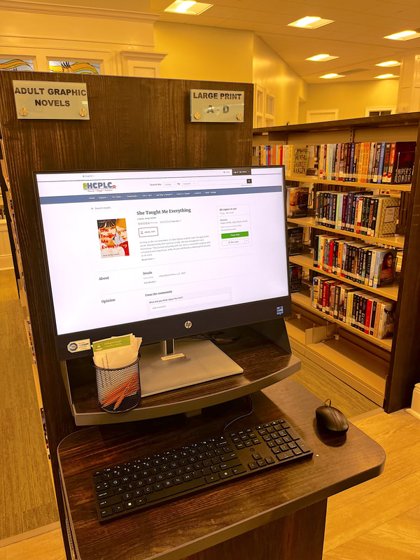 Looks like the system has already purchased an e-book copy, and THERE ARE SIX PEOPLE IN LINE to get it! Well, how about that? I wish I could share this joy with the librarians who helped me through 5th grade.  Meanwhile, should you be so inclined, ask your library to order a copy -- not only with it bring joy, it might bring you a useful gift card.
The first photo of She Taught Me Everything on your public library shelf gets a prize! I wasn't a theater kid. I DID play the vamp in my high school play –– let's go ahead and blame the hair for that one –– but I'm not usually one to muscle my way to center stage. As for my novel, it would be pretty to think a book will simply find its readers by the quality of existing –– like the movie starlet perched on a stool at a soda fountain. ...But the trick is that she must be SEEN perching. The Hollywood fantasy persists in our screen-heavy world long after soda fountains have faded into history. Hence my flurry of Instagram and TikTok activity. Since I don't have the budget of a big publishing firm, here I am, adding my voice to the democratic chorus of social media. One excellent piece of advice I heard was "don't be spammy." So instead of incessantly jabbering on about me-me-my-my book, I'm on one of those other topics I can piffle cheerfully: other books I think people will love. Shocking as it is to hear my own voice and get the visual (again, blame the hair), I'm embracing the experience. And from time to time channeling my inner Sophia Coppola... It's all an experiment, really.
October finished up with me working the phone banks and hitting a few of my favorite bookstores. Publicity is always a challenge, never mind whether it's a busy newsday or a slow one. But here are a few mentions. Feel free to pop by and give them a thumbs up if you feel like it. It's kind of amazing how mashing that "like" button makes the almighty algorithms pay attention to a thing...It's Matrixy, but hello 21st Century capitalism --! Here' the book featured on a blog (oooh!) https://proofpositive.com/great-books/she-taught-me-everything/ And here's a quick interview with the author... https://digitalbooknook.com/2023/11/01/interview-with-amy-smith-linton-author-of-she-taught-me-everything/?fbclid=IwAR1zU-IgZzBToK-HuAuwejyn0k2iMLsRpudCltscY3GtRmLP01sJ6j9e72Q And, oy, even on Pinterest... https://www.pinterest.ca/pin/486318459776918697/ Scroll down to see tweets (or are they exes?) at https://twitter.com/BackyardBooks https://twitter.com/dgtservices/status/1719685939990343998/photo/1 I don't spend a lot of time perusing the good and not-good reviews on Amazon and Goodreads. It's not why I write. But again, it's a kindness to the book if you'd like to react to online reviews. https://www.goodreads.com/book/show/195660796-she-taught-me-everything https://www.amazon.com/She-Taught-Everything-Smith-Linton/dp/B0CJDJVWXK/ref=sr_1_1?crid=1X7NKI8CF1V9&keywords=she+taught+me+everything&qid=1698893395&sprefix=she+taught+me+everything%2Caps%2C156&sr=8-1 And ooh...world-famous in the vest-pocket world of the Would-Be Farm. 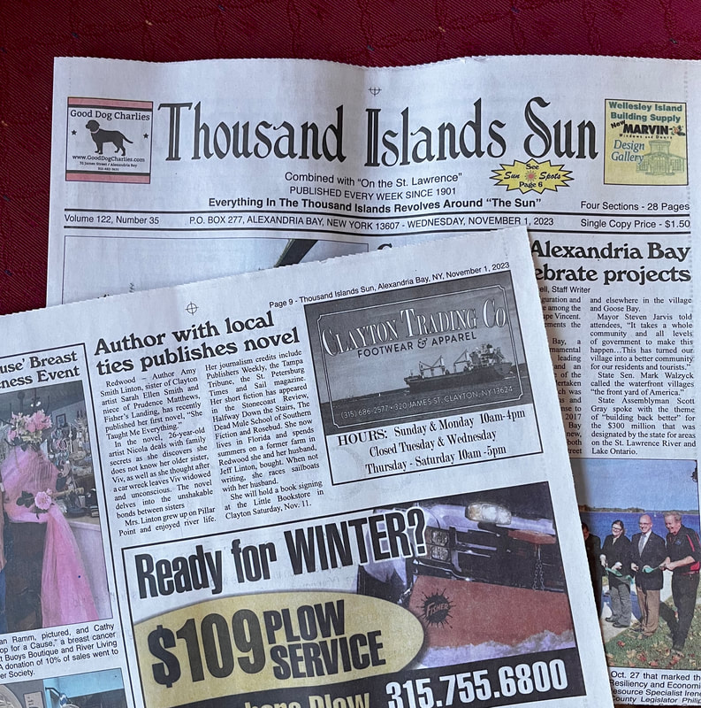 If you're going to achieve a lifetime goal, you might as well pause for a moment and gather together some of your bestest peeps to celebrate. I'll admit, I spent a restful couple of hours perusing potential theme beverages... Oooh, a maple-beet shuberita? Given that I was borrowing a house for the party, and a beet-based drink MIGHT have indelible consequences... I chose a white Sangria-is-Thicker-than Blood, an icy Emily Dickenson (Because I Would Not Stop for Death/He Kindly Made Me Tea), and cheerful ole beer. 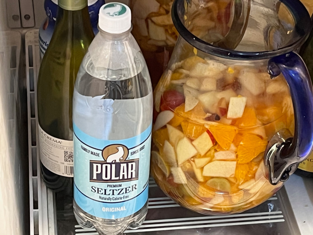 So, when you're planning a party around books, what's an appropriate party decor? How about that entire filing cabinet of revisions to the novel from writing workshops, my beloved writing group, and beta readers? Those dead tree carcasses transmogrified into table-runners, decorative garland. and decorative stars. 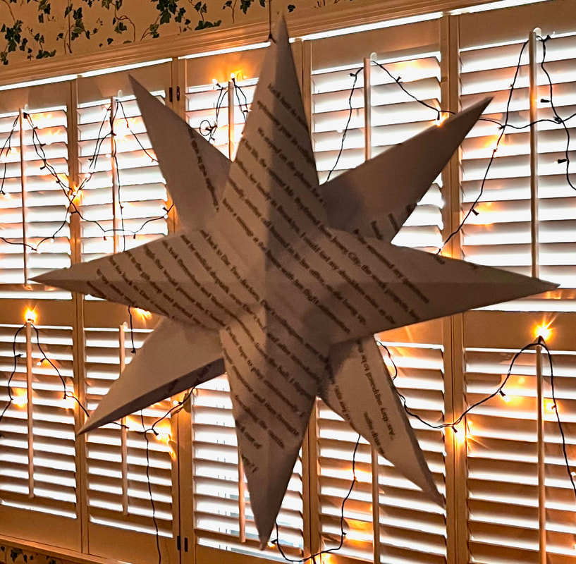 Because the main character, Nicola Jones, is an artist, we set up an artists' station, with paint and blank watercolor paper in the form of bookmarks and postcards. Bookmarks for reading, of course, but postcards because –– well, it's part of the novel to perhaps encourage you to pop a note in the mail, saunter back across that burning bridge, maybe reconnect with someone. And plus––obvie!––pretty colors. 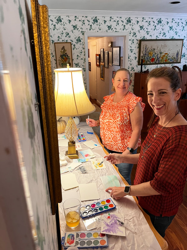 Books arrived in time (Hurrah!). 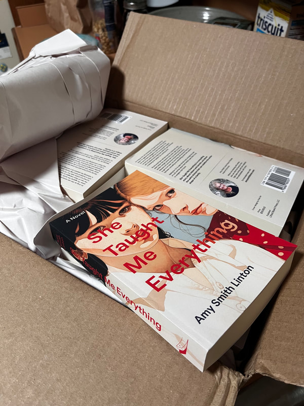 At my cheerleader-in-chief, Jennifer Holmberg's, suggestion, I set up a Venmo for the "bookstore." And we established the pile of books next to the television, so Mr. Linton could both mind the store AND watch the game. The day was amazing. There was so much good food, and so many good friends! I signed books (okay, okay, confession time: I DID practice a formal "author's signature" different from my usual legal scrawl, a practice that felt both transgressive and exhilarating, like wearing someone else's steep, very glamorous shoes). 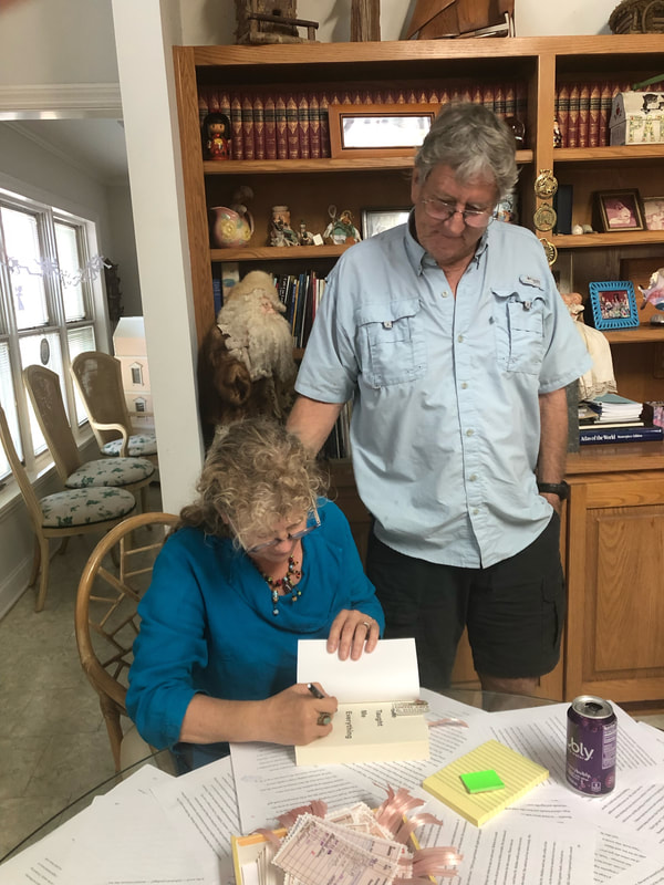 It was also my public reading debut. This is a red-letter-day event for any author: to project words into a public space? Lawsieday, that's a big dang deal. I'm not shy about speaking in public--one of my past jobs involved what the industry calls "stand-up training," where you have an audience of adults who are meant to learn something by corporate fiat. Imagine the enthusiasm. But this crowd--! Awesome. Made me feel like a million bucks. 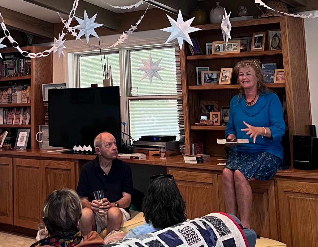 Was I weepy? Did I feel my heartstrings plucked and twanged by the kindness of my people and family? Did I also laugh with immoderate mirth? I regret only that I did not take more photos.
When building a book, there's a fussy little formula to keep in mind to place typeset pages in the correct order for "imposition."
To produce a book, commercial printers started with a very large piece of paper. They'd lay out 8 or 16 seemingly random book pages on one side of the big piece, and then also on the opposite side. After both sides got printed, and after being folded just so, when three sides of the folded paper were trimmed, the result is a "signature." A signature is a nested, ordered set of pages that pops right into a binding. One signature is followed by another and another, until the whole book had been laid out, printed, folded, trimmed, and gathered for binding. 
That imposition was critical: one misstep and page 12 goes in upside-down on the back of page 3. Misplace a signature, and whole chapters end up in the wrong place or backwards. Quality control was always an issue.
These days, we generally rely on the unimaginative brains of computers to calculate our impositions. They do a good job of counting and placing and calculating cut margins.
More binding? Sure: we got spiral bound (with metal or plastic like datebooks and notebooks), and perfect bound that goes into a chip wood case (modern casebound hard-cover books).
Binding less often used for fiction, but worth noting: what looks like staples (like on class newsletters) is called saddle-stitch. Handmade, coolio craft binding, like stab or Coptic binding, joins each signature in a daisy chain to the next with often decorative stitches along the spine and the front and back boards. 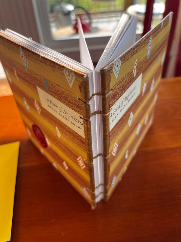
So long story longer, imposition and the requirements of printers is why picture books are traditionally 32 pages long (including title page, copyright notices, etc.). And why, if you should find yourself in a library, you can win a bet that those fat volumes contain a number of pages divisible by 8 for sure, and by 32 more often than you might think. In figuring out my own book in 2023, the math is SO much simpler. The physical book needs only have an even number of pages. The ebook does not. I won't deny I spent a great deal of time gazing into the soft glow of my monitor trying to make pages look good. There are things I like and don't like in my physical books, though to be honest, I rarely think about them. But this summer, I thought about them. A lot.
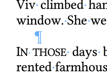
In a physical book, the pages on either side of the spine are referred to as recto and verso (right and left in fancy book-person talk).
In my world, recto pages need to have the heading and the page number out on the right side and additional margin on the left to make room for the "gutter." The gutter of course is the page-side of the spine. Mirror these elements across the gutter: verso type need to slide out left, with the page numbering and header also at the left side of the page. That way when a reader thumbs the pages, the numbers flicker along front and back on the lower outside corner of the page, and when the book is open, nobody needs pry at the book to read words near the gutter. 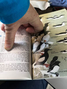
Just. Trying. To. Read. That. Number.
To make my book design unified, I picked the same display font (Instrument Sans) for the chapter headings as the artist had used on the cover. That meant importing the font (hi dafont.com) and checking to be sure I was using it legally. Then embedding it and Linux Libertine (a snappy font for the text NOT the same old Times New Roman by way of Microsoft) into the document. After long consideration, I made the Instrument Sans headings a couple of degrees less black than the text, since that font is fairly heavy, and I liked it to look a bit more subtle. I decided whereabouts to position the start of a chapter on the page (165 points from the top margin, I think is the measurement. Point? Yeah: it's 1/72nd of an inch. 12 points makes a pica. 6 picas are an inch. When are we going metric again?). Why 165 points? Because, frankly, I trial-and-errored that margin until I got the least number of wonky-looking last pages of the chapters. To check this, I zoomed out and scanned the document 46 pages at a time. There's no getting away from those darned multiples of 8. I added and subtracted and modified the Chapter Heading style until the least number of lost last lines of the chapter hung solo on the page like laundry flapping in the breeze. The things we do for love. 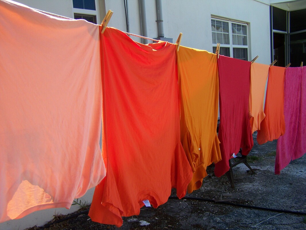
Before Gutenberg, when scholars spent hour after hour hand-copying books to make a library, they sometimes kept themselves entertained by making fancy initial letters. We call them "drop caps." I find them a bit distracting, but I DO like a bit of ceremony at the start of a new chapter. So instead of trying to find a handsome big first letter, I put the first word or two of each chapter into capital letters. Only instead of garden-variety capitals, I picked "small caps." which look like this:
When there's a break in the story––less than a chapter break, but more than simply the next paragraph––there's often a line or two of extra space. Some designers chose to put in a tiny design element, like a leaf or an asterisk, known as a "dingbat." Again, I find these elements both charming and distracting, so I decided instead to use those same fancy small caps on the initial words instead.
Rewind...dingbat? I love English. So many odd words with odder etymologies. It's not a very clear story, but "ding" probably comes from the Dutch for "thing." So a dingbat is a thingamabob. It also, separately, means a foolish or useless person, and a sort of visual, verbal riddle.
Then, to save myself extra misery, I made an entirely new Word document into which I poured the formatted manuscript. It's very important, by the way, to set the document up as the size you want. For instance 5x8 inches versus 5x7.
Just sayin. Because who is going to forget something basic like that? <raises hand shyly> 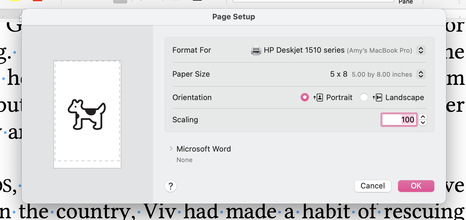
Then cross fingers and toes and save it all as a PDF (Printer Document Format) file. The printers at Kindle Direct and at IngramSpark both read the PDF and use it to make a book.
And with the snap of a finger (plus a week or more waiting for the UPS truck and the application of some money), a proof copy shows up, and you find out if it looks the way you hoped it would. Go back and forth a few times, getting that margin right (5 by EIGHT, 5 by EIGHT). Approve the draft on IngramSpark and re-cross fingers it will show up on their catalogue in two weeks and be available for libraries and booksellers to order in October. Approve the other draft and it too will be available in October. October! Dang! Already?! 
For the ebook, I copied that same formatted document and stripped out nearly all of those careful stylistic choices. There are no recto-verso conventions for an e-book. There are no page numbers and no headers. The font is an either/or: either serif or sans serif, and individual readers have pre-set that choice already, at least on Kindle. Any blank pages get ditched in the interest of electronic reading. I saved the barer-boned document as an EPUB (electronic publication file), uploaded it it Kindle, and quadruple-checked it on the preview to be sure nothing had gone pear-shaped. I approved the changes, took a very deep breath, and poured myself a small libation. May the gods of printing presses look kindly on me and my offering. 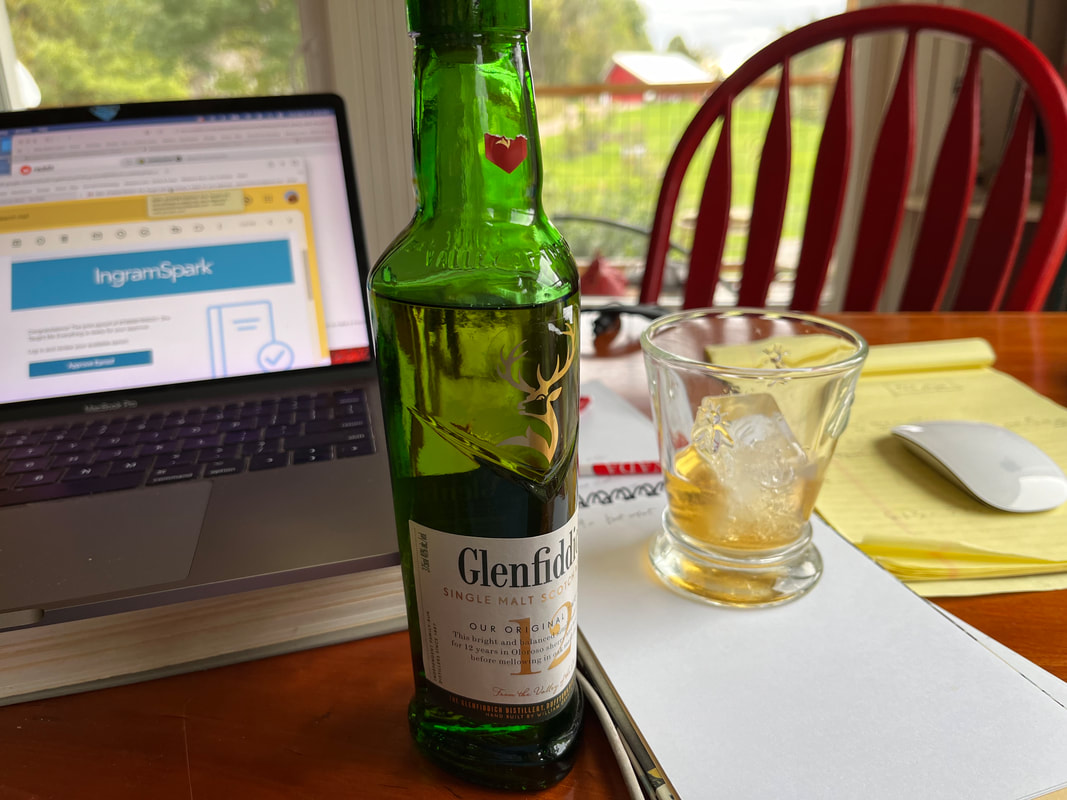
Apple Books, Kobo, and Nook will wait for another day, but as of now...the book is really, truly, for sure, actually on its way. Publication date is October 15.  Book reviews. How often has a person's opinion hitched you up with a book? Not just the professional sources, like NPR's "All Books Considered," The New York Times Review of Books, Publisher's Weekly, but also your friend Fran who ADORED something and insists you MUST read it. So you do. As an independent publisher, I don't, as the Brits say, pull––not the household book reviewing names, anyhow. Lucky for me it's a brave new world. Instead of sending my book baby out to work the streets without any bona fides, I have options. For instance, NetGalley. This is a service that hooks up reviewers, librarians, booksellers with Advance Readers Copies (ARCs or electronic e-ARCs). The publisher pays for the service and the reader gets a free copy in exchange for an unbiased review. There are some hundreds of thousands of readers on the site, and if we know nothing else, we are sure that FREE is a magic word. I joined a co-op (Victory Editing. Highly recommended!) and put She Taught Me Everything up for review for a month. I selected the option where each person who wanted the book had to get vetted first. So for three and a half weeks, I spent part of each day clicking and assessing potential readers. NetGalley gives publishers plenty of data about the potential reviewers: name, email, links to ALL of the reviews they've posted on NetGalley, plus their socials. So my daily routine had its moments: I'll never again have the chance to shoo die-hard twisty-psychological-suspense fans away from my title, and here's hoping I don't have to again investigate whether a person is in fact an employee of Barnes & Noble. Anne of Victory Editing recommended being brutally ruthless in sorting the asks. Go with your gut, she said. Heard and acknowledged! If anything felt suss or sketch, I clicked "no." So Madam Butterfly with 27K+ Instagram followers requested the book, and I notice that her Insty posts are focused on beauty care products? Nope. Mr. Mixalot has over 5000 titles downloaded, but only 4 reviews posted in the last year? Nope. Lady Snippet's reviews are unkind and brutal? Uh, no. Prince Agu says he makes all the purchasing decisions at a bookstore and sets up monthly book clubs? Well, let's see. That would be a bookstore specializing in anime and used books in rural Pennsylvania, and his name is nowhere on the website? I think not. For every yes, there was about one and a quarter no. The results: according to the stats, 1700 or so people stopped to look at the title. Around 120 people downloaded the book to read. Reactions to the book, I'm very happy to say, are trickling in. Reviewers post to the NetGalley site, but also cross-post with Goodreads, Amazon (after publication), Insty, TikTok, the X formerly known as Twitter, and their own reading blogs. Here are a few of the early reactions. Squeeeeee. I know the metaphor has flaws, but baby book can strut those streets a little prouder now, with a few references in her back pocket. I'm as excited about my book as Steve Martin was in The Jerk about the new phone book. 
I keep trying the name on for size: an independent publisher. As in: "I'm an independent publisher."
When I was a baby editor in Manhattan, we had a Legal Department, Editorial, Art-Direction, Proofreading, Production, SubRights, Publicity, and Sales Departments. Now it's all me. 

I formed my own publishing house, Lifted Board Press, LLC, so all the things an author expects a publisher to do...it's on me.
Need an editor? I hire an editor. Need a beautiful cover? I hire a talented cover designer. Need an interior book design? Make it so, number one. I hope to neither humble-brag or complain, but wow. So many moving pieces here: not just getting the novel whipped into its best shape, but also figuring out comp titles and prices, subsidiary rights, and publicity.
The Sales department is flitting about like a punch-drunk moth, as the countdown clock tick-tock, tick-tocks (two months?! Yipes!).
These days, book reviews are the lifeblood of authors in the new publishing world –– book reviews used to be pretty cinchy: I'd flick through the office Rolodex, whip up a stack of labels on my IBM Selectric, type multiple letters with essentially the same message to various book review editors, pop them into a padded envelopes with an Advanced Readers' Copy (ARC) and drop them into the mail. These ARCs would end up who knew where (sometimes in the thrift shop bookshelf), but that's how (plus some schmoozy phone calls and backstage deals) we got book reviews into newspapers and magazines.
No surprise to learn that things have gone electronic these days. There are only a few book reviewers in the media; people aren't as willing to pay for news, so they tend look for recommendations from places like Goodreads and Amazon and Instagram, or from actual word-of-mouth.
As an independent publisher, I joined a co-op and put the book out for review on a central service. That's not nerve-wracking at all. The Publicity department created author pages on Goodreads and Amazon and Ingram Sparks, aiming for just the right tone of cheeky self-promotion in with the bona fides. A book trailer went up on YouTube and Insty, and the department is brainstorming the next one.
Meanwhile, downstairs in the Production department, I've studied about 137% more about file formats and how NOT to convert them than I ever hoped to do: epub, jpeg, png, pdf, wtf, try again.
Even though Ingram Sparks and Amazon paperbacks are more or less indistinguishable, each has its own protocol for formatting. Different ebook companies have wildly differing file requirement, so we here at Lifted Board, LLC must coordinate Apple, Kindle, Nook, and Kobo versions. 
Two months is a long time in dog years.
Happily, the Art Department is an outside resource who knows his business (THAT's why you hire the best you can afford!), so we hope each edition will be a joy to behold.
Enough about my bliss. The Publicity department is direct-messaging over and over (ding! ding!) about posting a short unboxing video and Production has got to get a move on. Are the small roadblocks on the way to this moment interesting or important? Hecky-doodle NO. What's interesting and important to me: allow me to reveal....the cover! 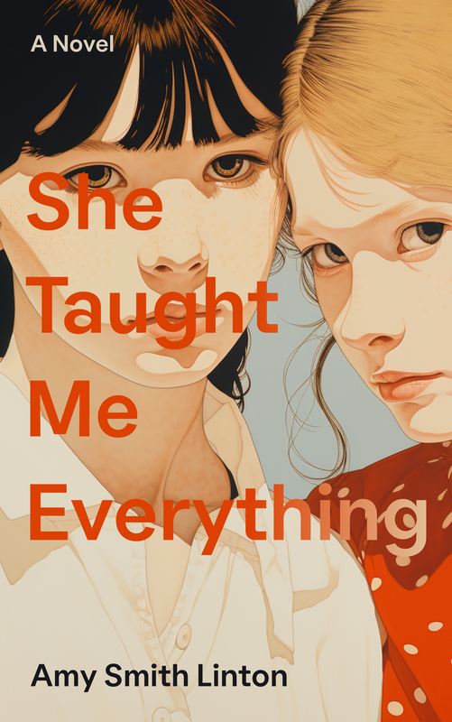 The book itself –– a novel for adults about the remarkable secrets sisters can conceal from one another –– will be available for purchase in paperback and e-book form in October.
|