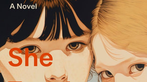
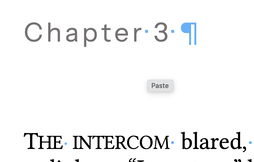
She Taught Me Everything
Wrote it. Now for the next part.

Wrote it. Now for the next part.
|
When building a book, there's a fussy little formula to keep in mind to place typeset pages in the correct order for "imposition."
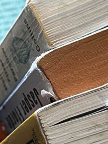
To produce a book, commercial printers started with a very large piece of paper. They'd lay out 8 or 16 seemingly random book pages on one side of the big piece, and then also on the opposite side. After both sides got printed, and after being folded just so, when three sides of the folded paper were trimmed, the result is a "signature." A signature is a nested, ordered set of pages that pops right into a binding. One signature is followed by another and another, until the whole book had been laid out, printed, folded, trimmed, and gathered for binding. 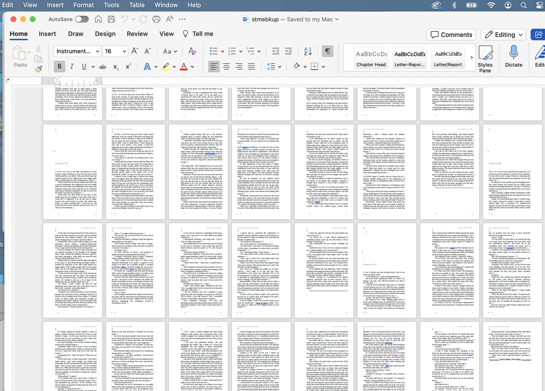
That imposition was critical: one misstep and page 12 goes in upside-down on the back of page 3. Misplace a signature, and whole chapters end up in the wrong place or backwards. Quality control was always an issue.
These days, we generally rely on the unimaginative brains of computers to calculate our impositions. They do a good job of counting and placing and calculating cut margins.
More binding? Sure: we got spiral bound (with metal or plastic like datebooks and notebooks), and perfect bound that goes into a chip wood case (modern casebound hard-cover books).
Binding less often used for fiction, but worth noting: what looks like staples (like on class newsletters) is called saddle-stitch. Handmade, coolio craft binding, like stab or Coptic binding, joins each signature in a daisy chain to the next with often decorative stitches along the spine and the front and back boards. 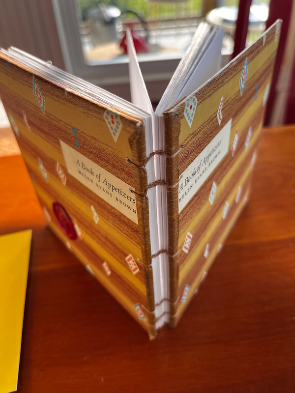
So long story longer, imposition and the requirements of printers is why picture books are traditionally 32 pages long (including title page, copyright notices, etc.). And why, if you should find yourself in a library, you can win a bet that those fat volumes contain a number of pages divisible by 8 for sure, and by 32 more often than you might think. In figuring out my own book in 2023, the math is SO much simpler. The physical book needs only have an even number of pages. The ebook does not. I won't deny I spent a great deal of time gazing into the soft glow of my monitor trying to make pages look good. There are things I like and don't like in my physical books, though to be honest, I rarely think about them. But this summer, I thought about them. A lot.
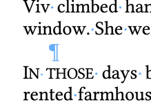
In a physical book, the pages on either side of the spine are referred to as recto and verso (right and left in fancy book-person talk).
In my world, recto pages need to have the heading and the page number out on the right side and additional margin on the left to make room for the "gutter." The gutter of course is the page-side of the spine. Mirror these elements across the gutter: verso type need to slide out left, with the page numbering and header also at the left side of the page. That way when a reader thumbs the pages, the numbers flicker along front and back on the lower outside corner of the page, and when the book is open, nobody needs pry at the book to read words near the gutter. 
Just. Trying. To. Read. That. Number.
To make my book design unified, I picked the same display font (Instrument Sans) for the chapter headings as the artist had used on the cover. That meant importing the font (hi dafont.com) and checking to be sure I was using it legally. Then embedding it and Linux Libertine (a snappy font for the text NOT the same old Times New Roman by way of Microsoft) into the document. After long consideration, I made the Instrument Sans headings a couple of degrees less black than the text, since that font is fairly heavy, and I liked it to look a bit more subtle. I decided whereabouts to position the start of a chapter on the page (165 points from the top margin, I think is the measurement. Point? Yeah: it's 1/72nd of an inch. 12 points makes a pica. 6 picas are an inch. When are we going metric again?). Why 165 points? Because, frankly, I trial-and-errored that margin until I got the least number of wonky-looking last pages of the chapters. To check this, I zoomed out and scanned the document 46 pages at a time. There's no getting away from those darned multiples of 8. I added and subtracted and modified the Chapter Heading style until the least number of lost last lines of the chapter hung solo on the page like laundry flapping in the breeze. The things we do for love. 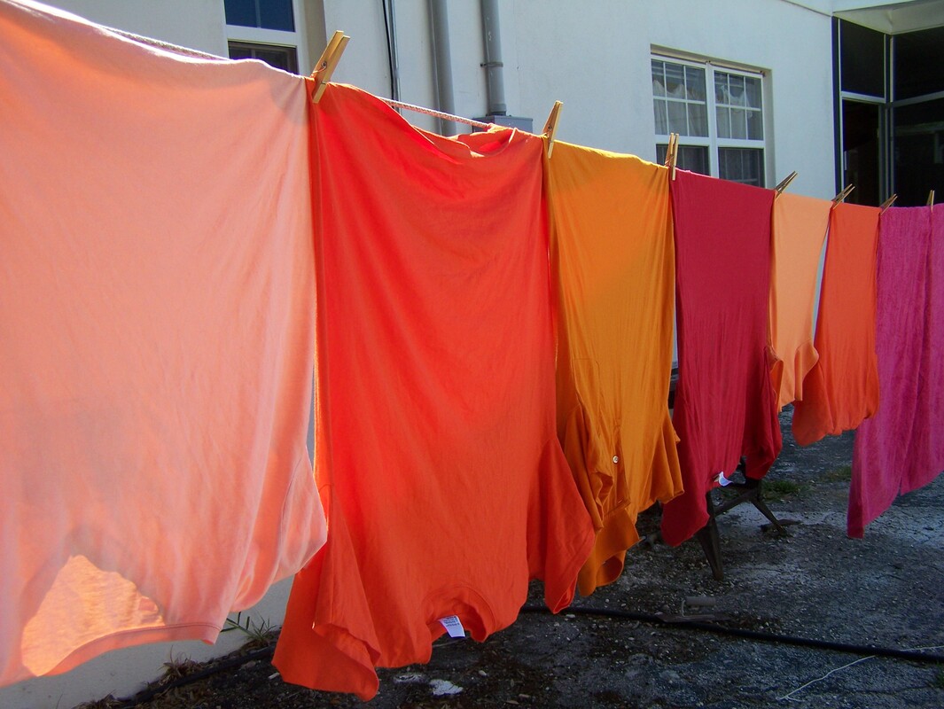
Before Gutenberg, when scholars spent hour after hour hand-copying books to make a library, they sometimes kept themselves entertained by making fancy initial letters. We call them "drop caps." I find them a bit distracting, but I DO like a bit of ceremony at the start of a new chapter. So instead of trying to find a handsome big first letter, I put the first word or two of each chapter into capital letters. Only instead of garden-variety capitals, I picked "small caps." which look like this:
When there's a break in the story––less than a chapter break, but more than simply the next paragraph––there's often a line or two of extra space. Some designers chose to put in a tiny design element, like a leaf or an asterisk, known as a "dingbat." Again, I find these elements both charming and distracting, so I decided instead to use those same fancy small caps on the initial words instead.
Rewind...dingbat? I love English. So many odd words with odder etymologies. It's not a very clear story, but "ding" probably comes from the Dutch for "thing." So a dingbat is a thingamabob. It also, separately, means a foolish or useless person, and a sort of visual, verbal riddle.
Then, to save myself extra misery, I made an entirely new Word document into which I poured the formatted manuscript. It's very important, by the way, to set the document up as the size you want. For instance 5x8 inches versus 5x7.
Just sayin. Because who is going to forget something basic like that? <raises hand shyly> 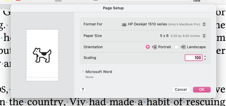
Then cross fingers and toes and save it all as a PDF (Printer Document Format) file. The printers at Kindle Direct and at IngramSpark both read the PDF and use it to make a book.
And with the snap of a finger (plus a week or more waiting for the UPS truck and the application of some money), a proof copy shows up, and you find out if it looks the way you hoped it would. Go back and forth a few times, getting that margin right (5 by EIGHT, 5 by EIGHT). Approve the draft on IngramSpark and re-cross fingers it will show up on their catalogue in two weeks and be available for libraries and booksellers to order in October. Approve the other draft and it too will be available in October. October! Dang! Already?! 
For the ebook, I copied that same formatted document and stripped out nearly all of those careful stylistic choices. There are no recto-verso conventions for an e-book. There are no page numbers and no headers. The font is an either/or: either serif or sans serif, and individual readers have pre-set that choice already, at least on Kindle. Any blank pages get ditched in the interest of electronic reading. I saved the barer-boned document as an EPUB (electronic publication file), uploaded it it Kindle, and quadruple-checked it on the preview to be sure nothing had gone pear-shaped. I approved the changes, took a very deep breath, and poured myself a small libation. May the gods of printing presses look kindly on me and my offering. 
Apple Books, Kobo, and Nook will wait for another day, but as of now...the book is really, truly, for sure, actually on its way. Publication date is October 15.
4 Comments
Bob Johnson
9/26/2023 04:05:44 pm
Thanks for the inside scoop. Something new was,earned today.
Amy
9/28/2023 04:20:30 pm
Glad to hear it! Thanks for stopping by the blog!
Sarah Kruse
9/26/2023 04:51:49 pm
This gave me a little publishing days ptsd. 😀 Can’t wait to read the book and so impressed that you made it happen!
Amy
9/28/2023 04:20:57 pm
Thanks Sarah! Leave a Reply. |