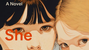
She Taught Me Everything
Wrote it. Now for the next part.

Wrote it. Now for the next part.
We judge books by their covers. Most of us can take in––at a glance––what sort of book a book is. And that's not a bad thing.
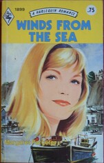
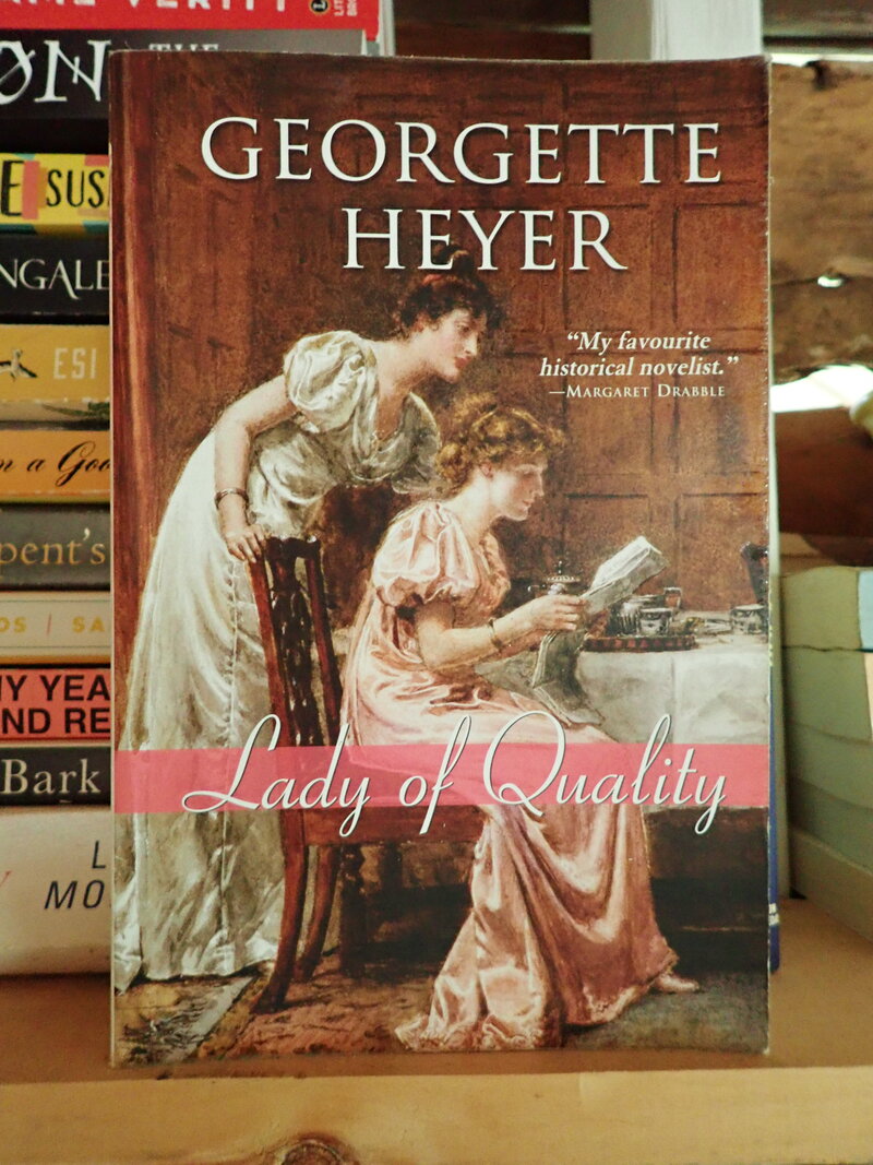
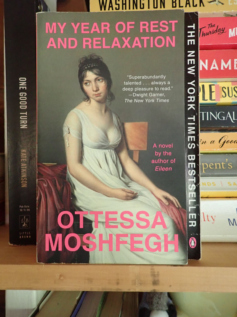
For instance, two covers with similar images: white ladies in Regency outfits, probably sourced from period oil paintings. The Georgette Heyer looks like a romantic romp of some sort, while the Moshfegh promises NOT to be any sort of sprightly entertainment. The difference is in the design: the mood of the paintings, the placement of the words, and the font. Signifiers. Got metal-foil raised letters and a stylized weapon on the cover? Military suspense. A cool photo of someone from a decade or more ago? Maybe a memoir. Hot pink cover with a pair of oversized sunglasses? Probably an amorous adventure set in the big city.
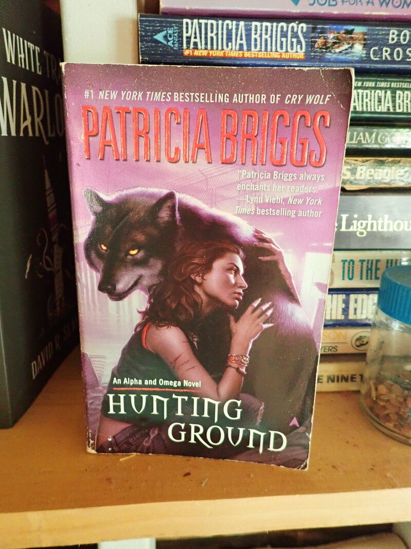
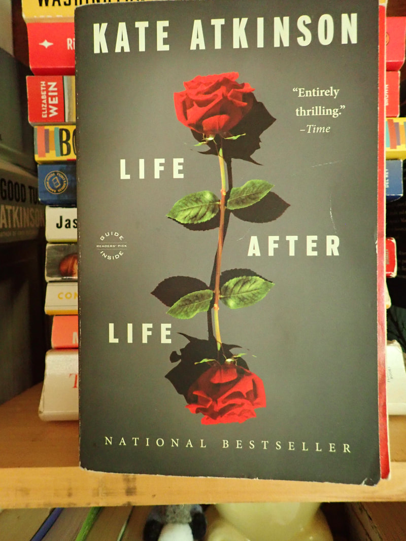
Signifiers can include the obvious (woman+wolf with manly torso) as well as the more subtle (the type font for Hunting Ground is specific to fantasy/speculative fiction. It's all about helping the reader find the book. A cat lover would know that Hunting Ground might not be a good fit. With covers like Kate Atkinson's Life After Life, signifiers are subtle on top of subtle: the font choice says "serious" but the image is...peculiar. The roses are pretty but imperfect reflections, which kind of tugs at the attention to make sense of it. As befits with the theme of the book.  The point for an independent publisher like myself? It means it's time to get a cover on this novel. In strictest honesty, this process started earlier in the year, when I spent way too long snapping photos in every bookstore. And browsing listicles like this, or this.
And then came the familiar, depressing part, where I started e-mailing designers. And Fiverr. And contacting the designers recommended by other independents. And waiting.
While wall-flowering, I even tried my hand at putting a cover together myself. My skillset lies elsewhere, but I enjoyed Canva. Meanwhile, the stuff inside the cover was chug-chug-chugging along. There's a sort of juggling act I never appreciated when working for a traditional publisher: the book's page count obviously affects the measurements for the book. The design of the interior can change the page count by a hundred pages in a big novel like mine. BUT the interior should coordinate with the cover. You kinda have to get everything done at once. I've got word processing skills, so that's cool (my eyes might be bleeding a little, but I'll walk it off). But the cover! Enter 99designs. 99designs by Vista is a design house that attracts a global pool of artists and designers. As a client, you can browse their site and find a book designer. The process takes a lot of looking and a lot of backing and forthing. Or you can host a contest and hope the right designer comes to you. I was reluctant to play this game at first. A little too much like singing for one's supper. But then, I've done my share of sample edits/writing samples to get a gig. Is it so different? So last week, I filled in the design brief, selected a price point, took a deep breath, and pressed, "Start contest." [story will continue...]
2 Comments
Lois
7/26/2023 09:49:09 pm
Yay, Amy!
Amy
7/28/2023 01:54:28 pm
Thank you, Lois! Leave a Reply. |